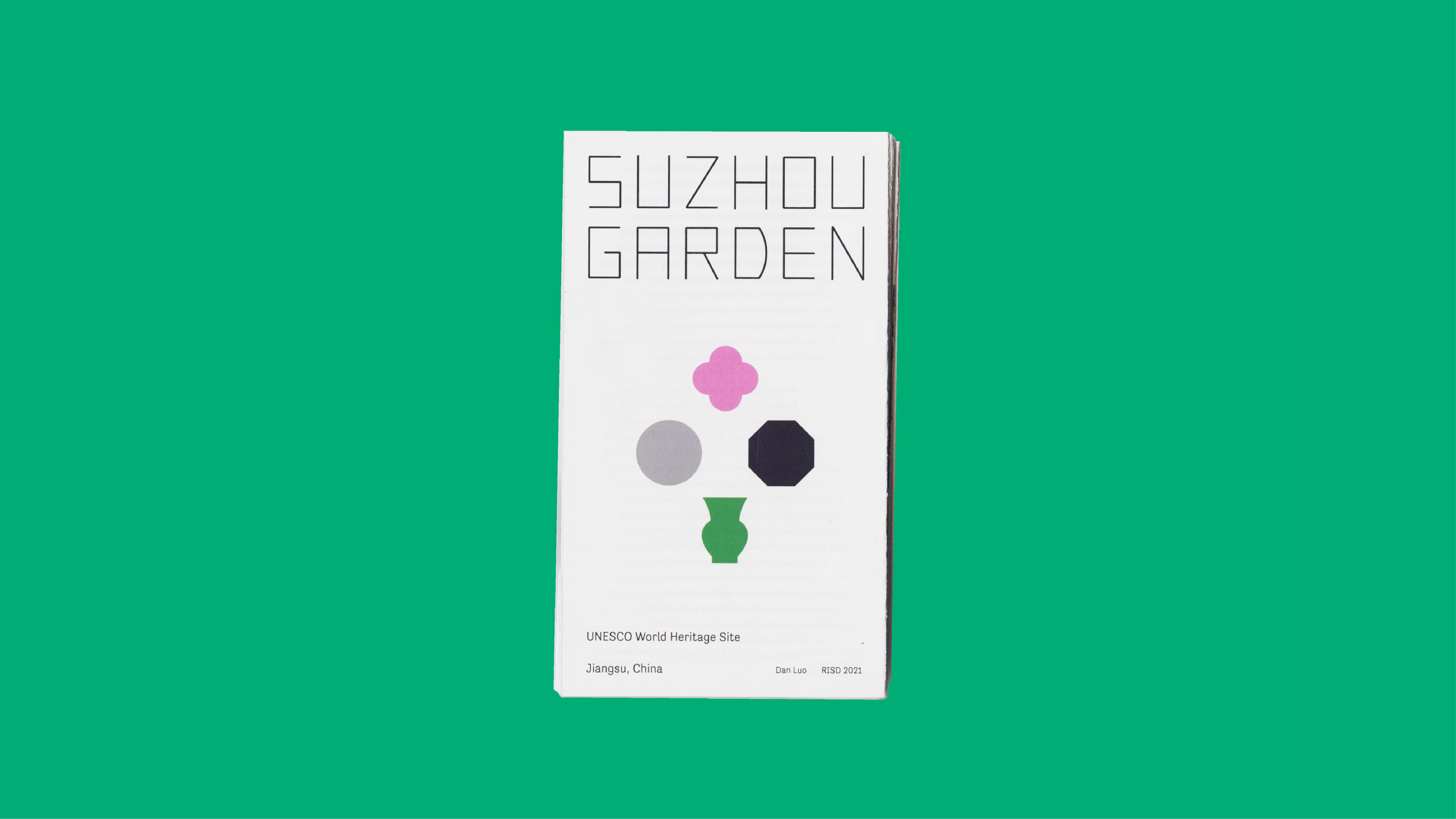
Suzhou Garden
Branding
Built between the 11th and the 19th century, the Classical Gardens of Suzhou are a group of gardens, which have been added to the UNESCO World Heritage List since 1997. There is no clear visual identity designed for this beautiful cultural heritage. The only one I can find is too random, unrecognizable, and outdated to represent a place with eternal poeticism. This sets me thinking about introducing a new visual system to better represent the beloved gardens.
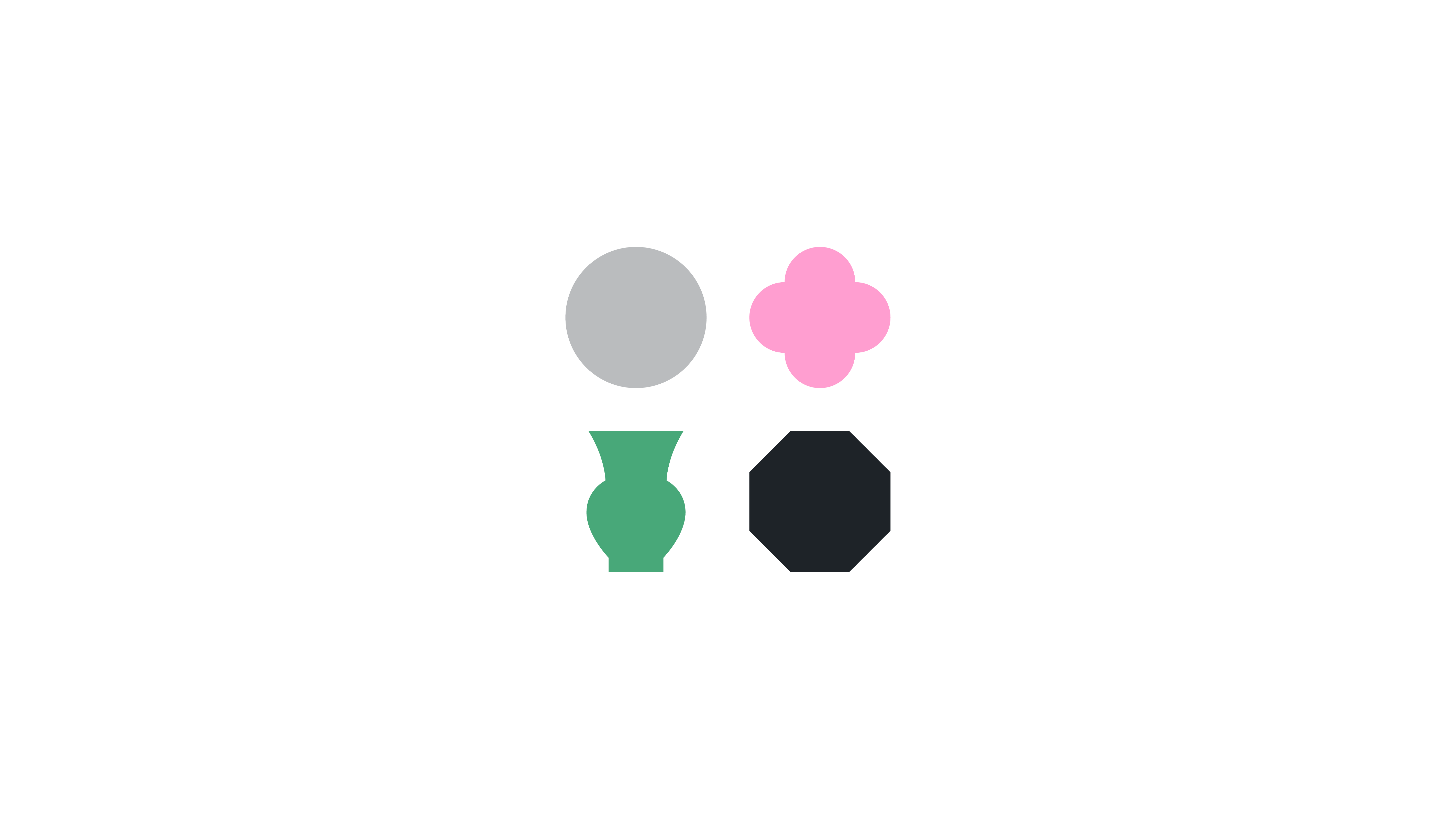
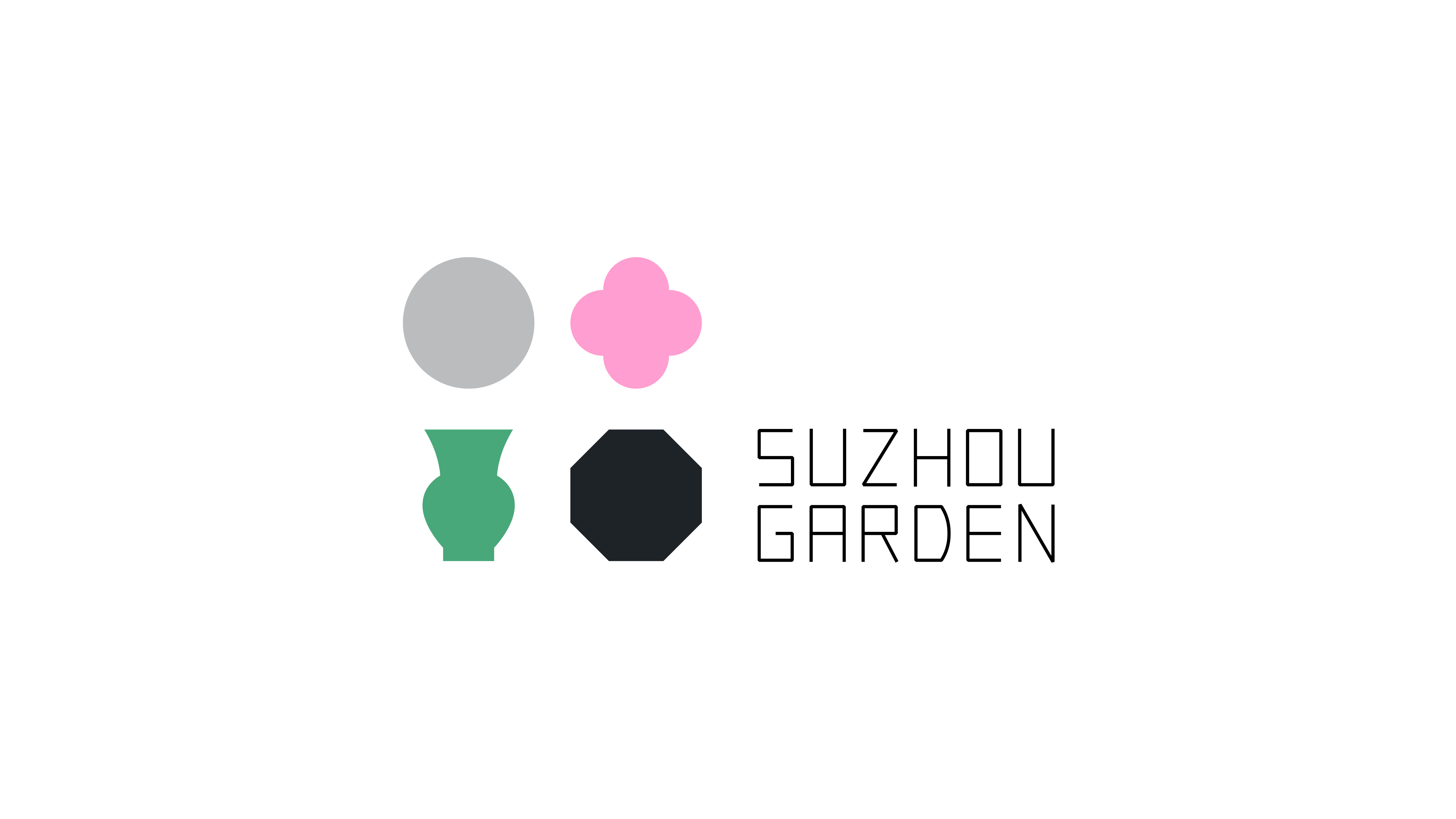
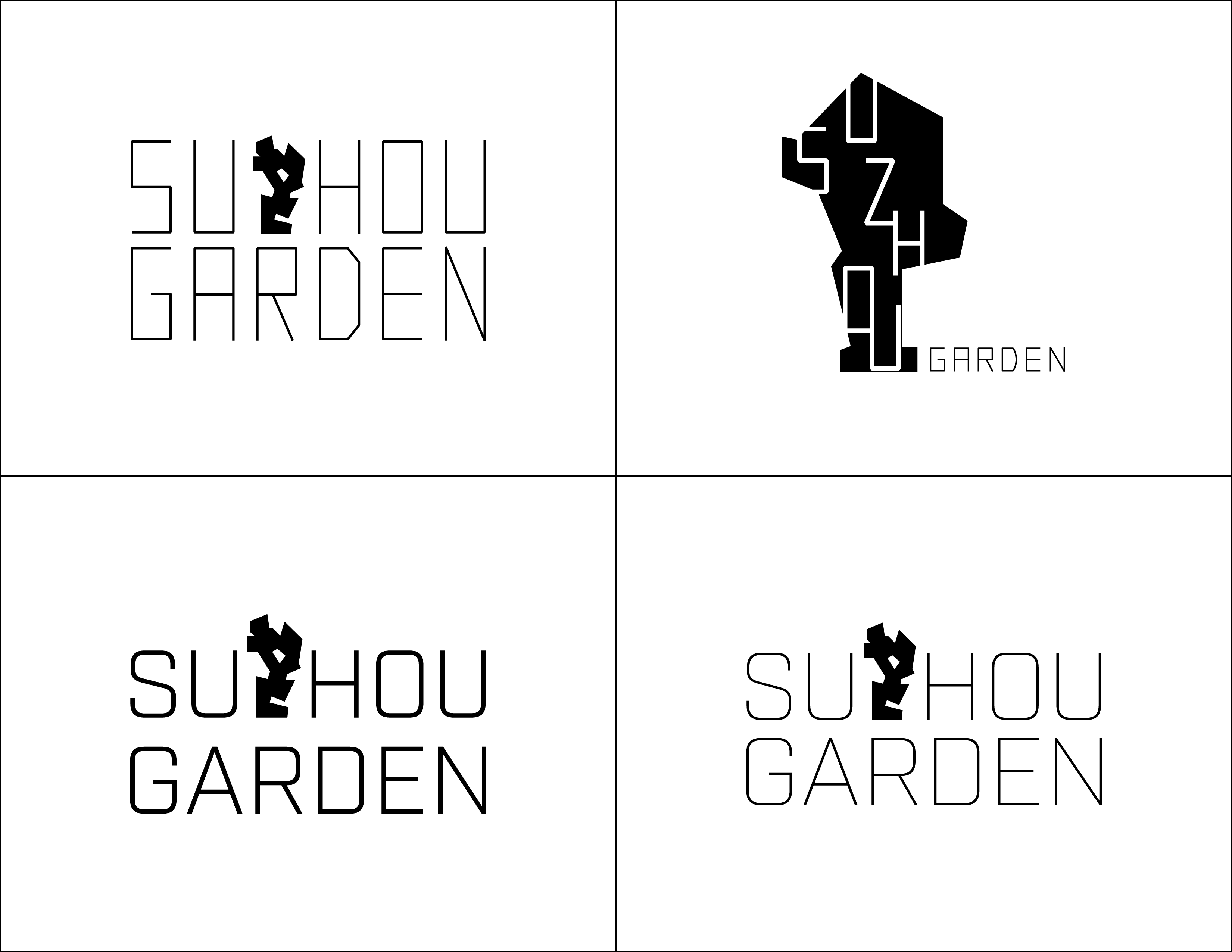
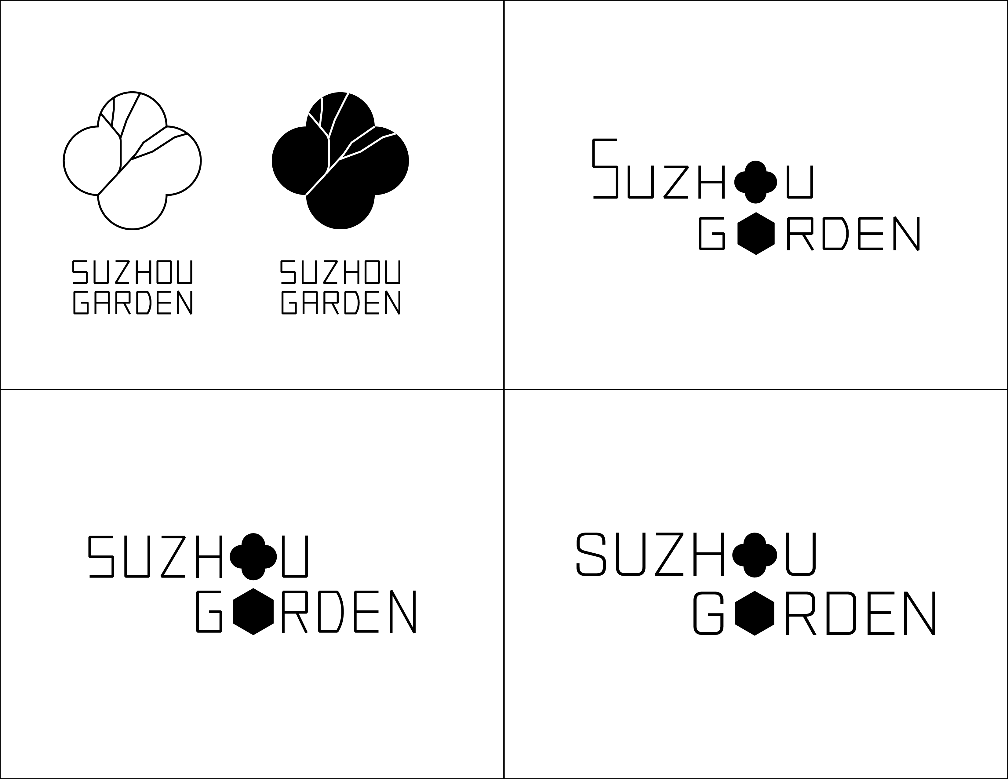
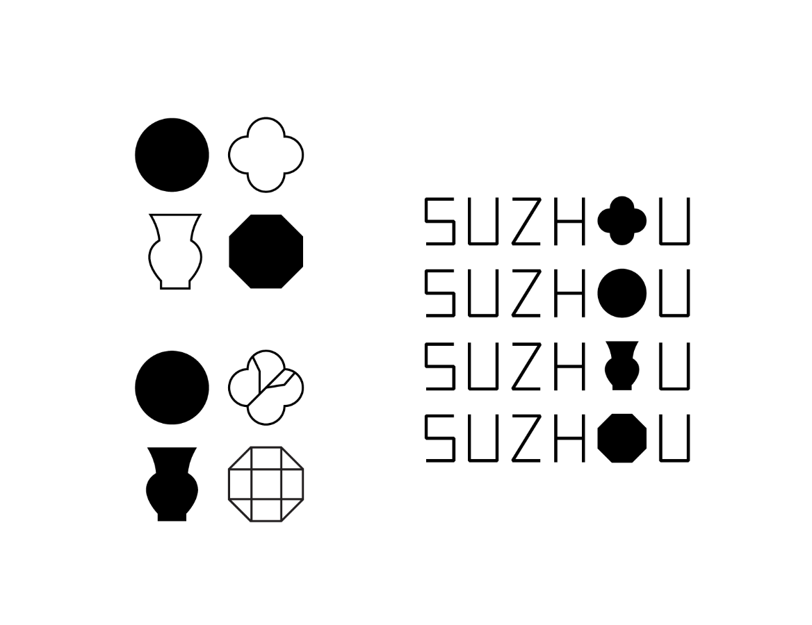
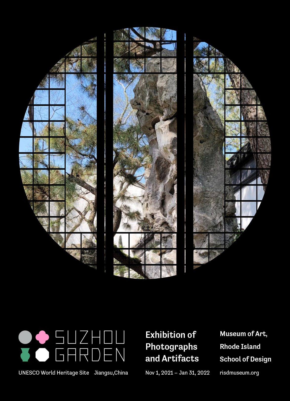
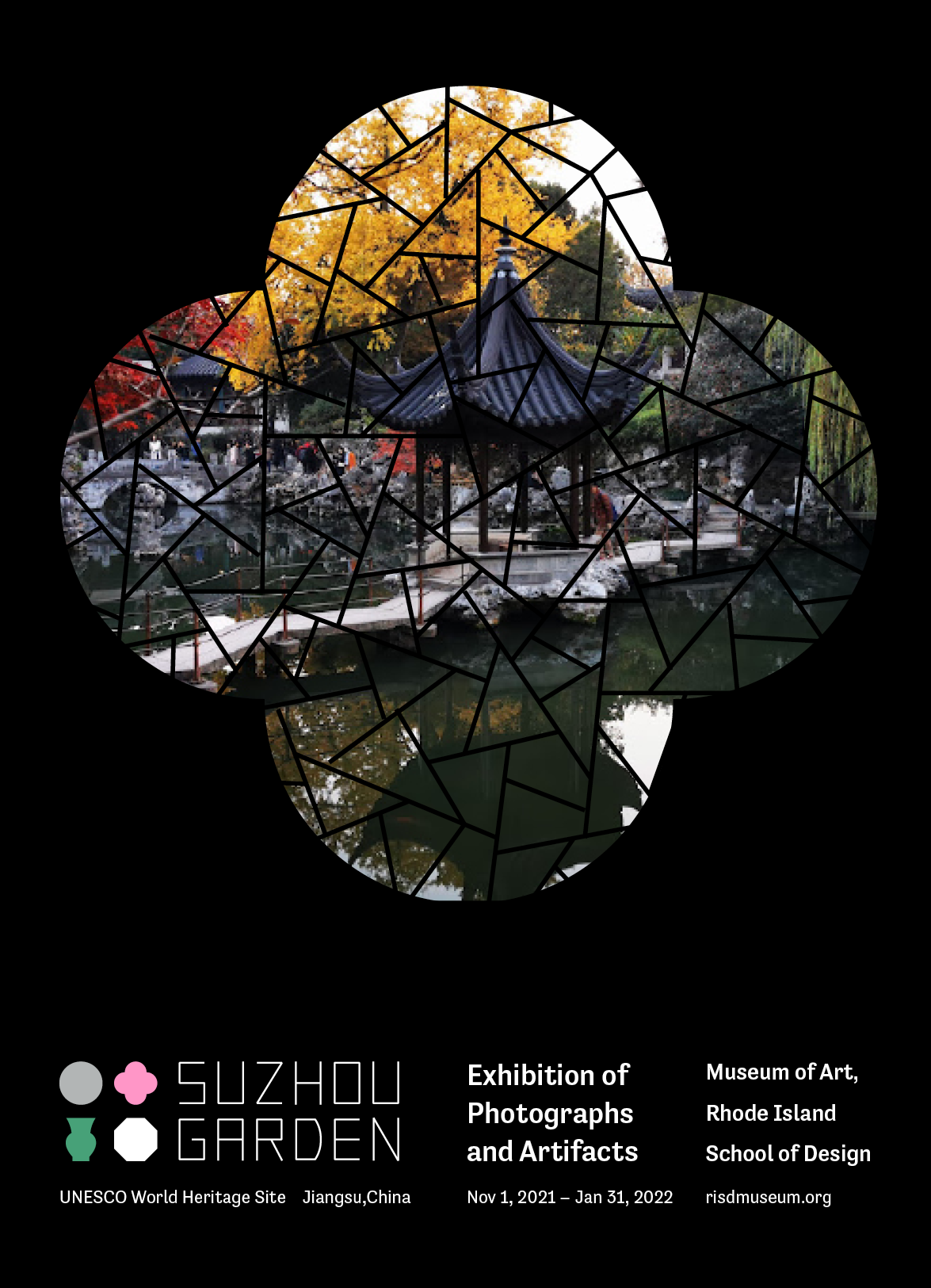
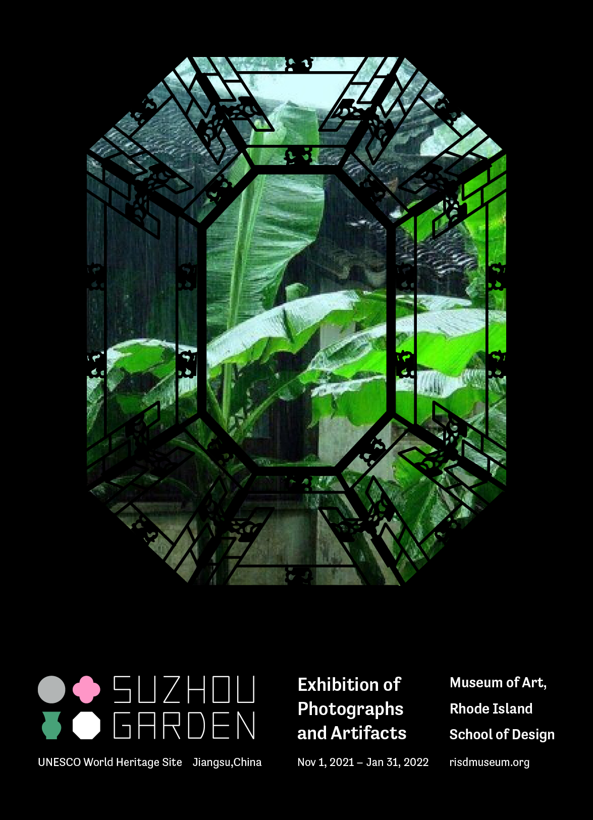
To encapsulate Suzhou Garden’s aesthetic simplicity and cultural richness, I created a new logo and a corresponding visual system with four memorable shapes derived from the gardens’ ornamental windows and gates. Each shape carries strong cultural connotations. When combined together, they form a poetic image(begonias under the moon and a jade vase in front of the window) that captures the elegant aesthetics of the Jiangnan region. The logo’s simplicity and geometry enable it to be applied and adapted to various contexts flexibly.
︎︎︎Scroll down to the bottom for more design process and thoughts behind the final outcome.
︎︎︎Scroll down to the bottom for more design process and thoughts behind the final outcome.

Booklet design
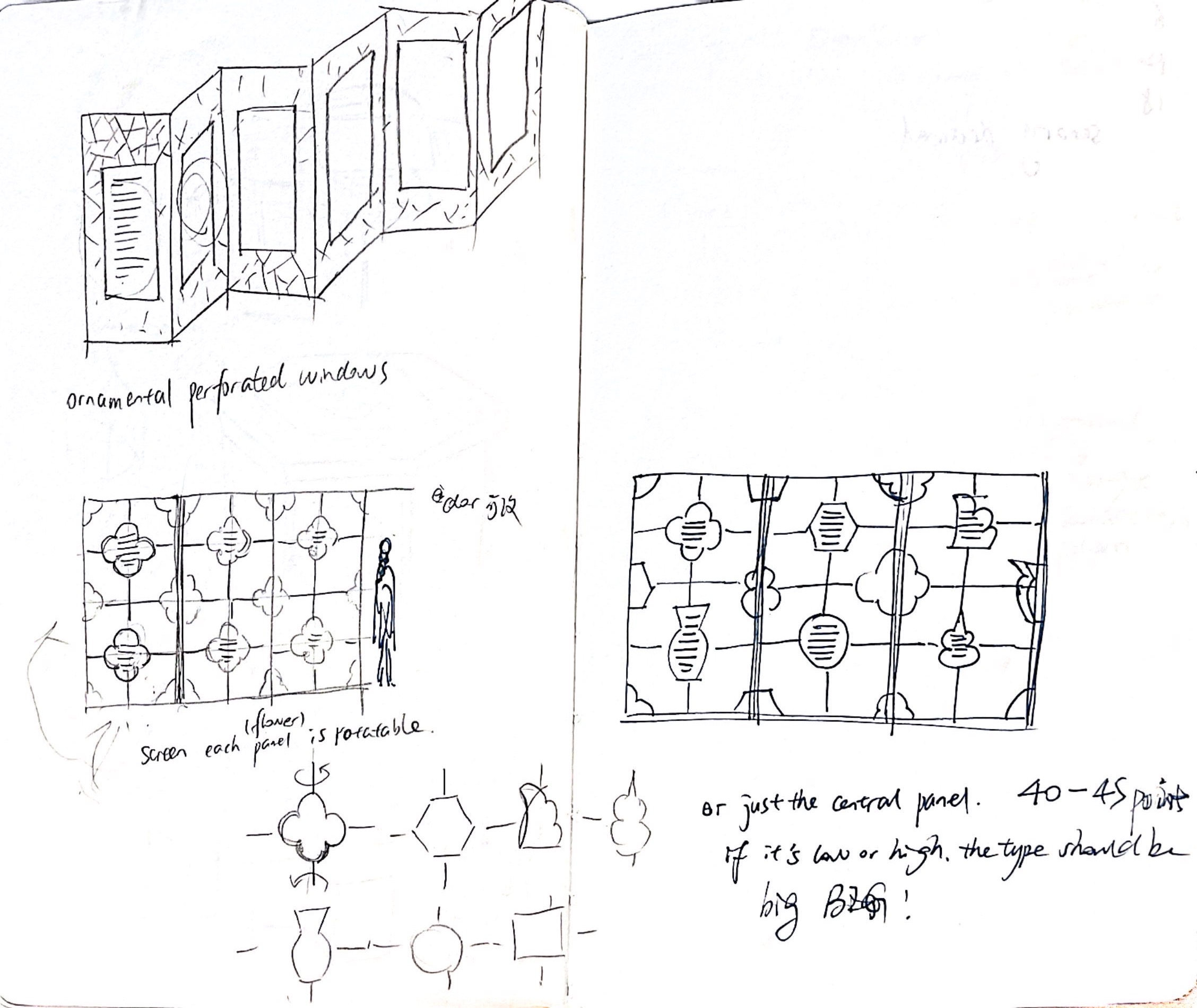
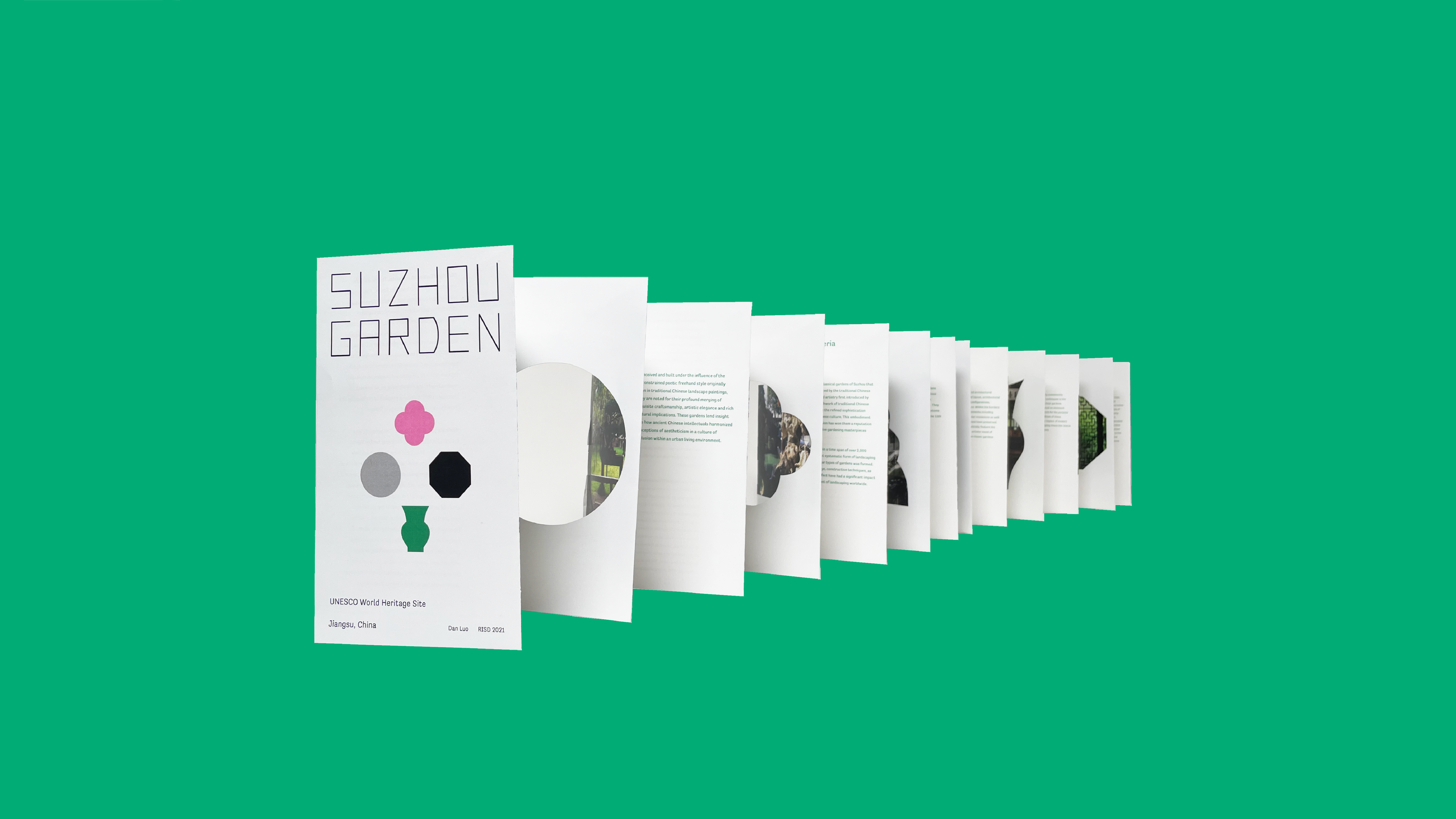
The accordion book is designed based on the core idea of Chinese garden design — 移步换景 (views change at every step). The book ends at its starting point and has different cutout shapes that mimic windows and gates on the walls. It thus provides a looping reading experience and makes readers feel that they are walking through the corridors in the gardens.
Series of advertisements in The New Yorker Magazine
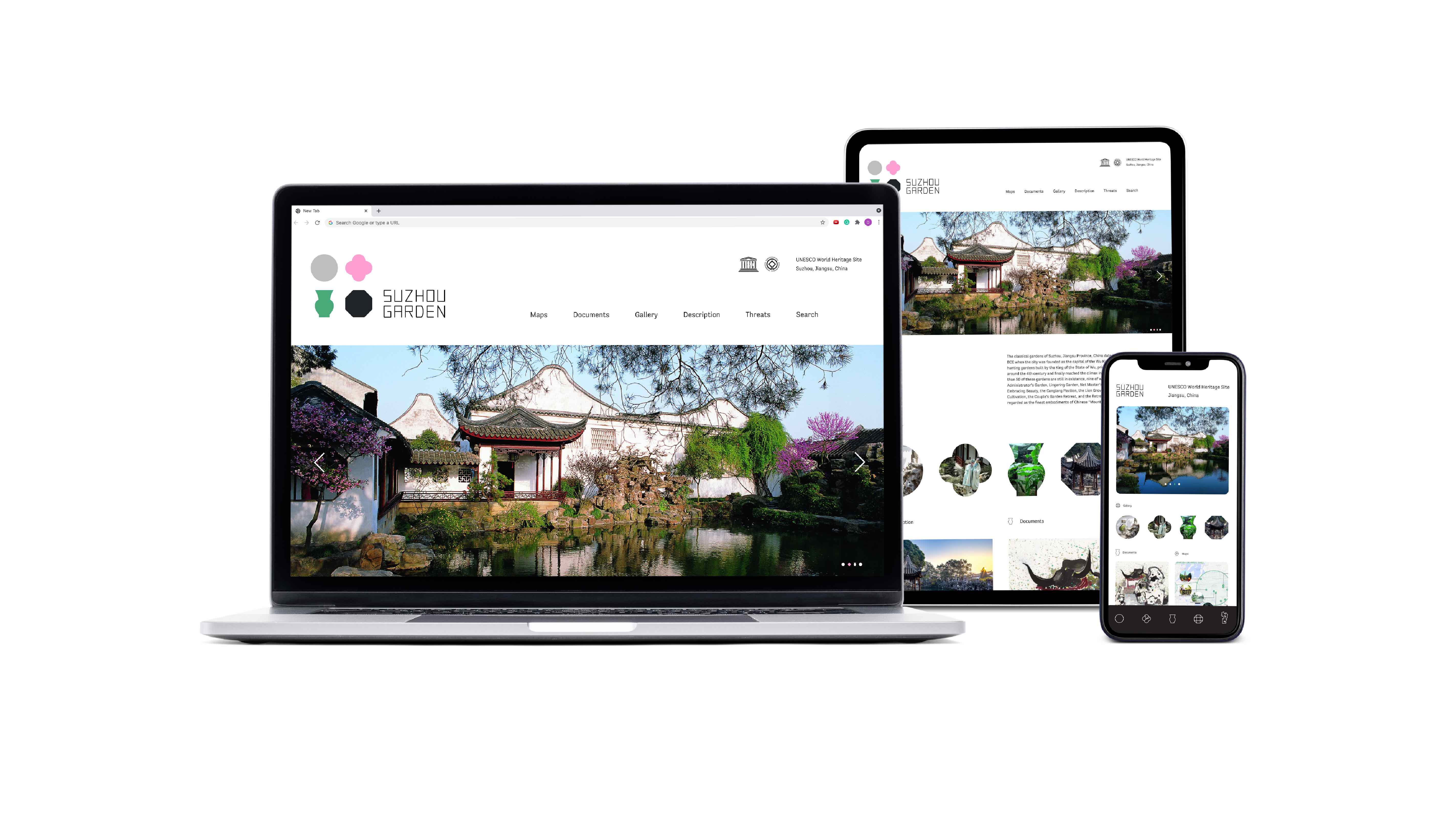
Web landing page & mobile app button
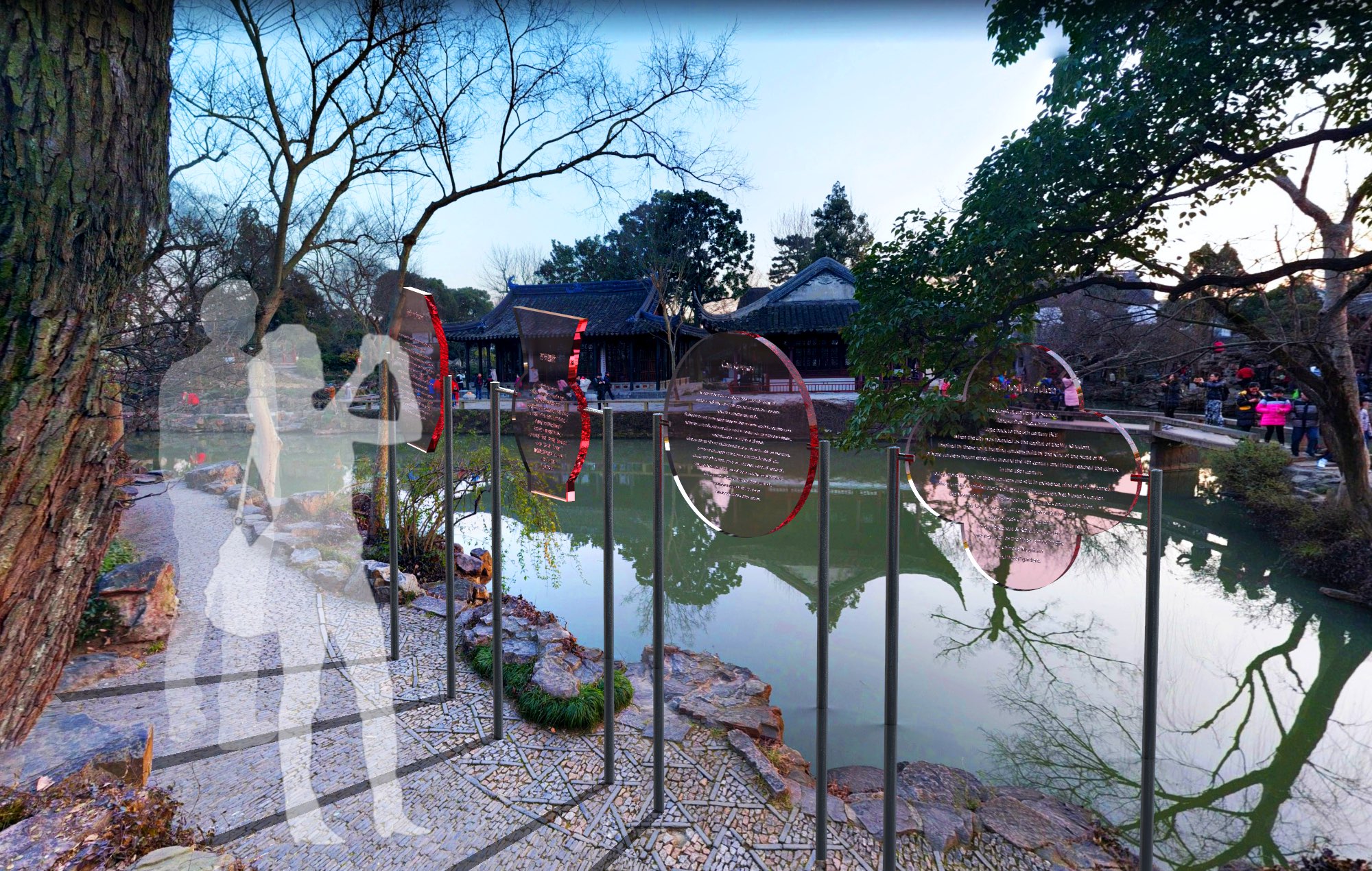
Site sign
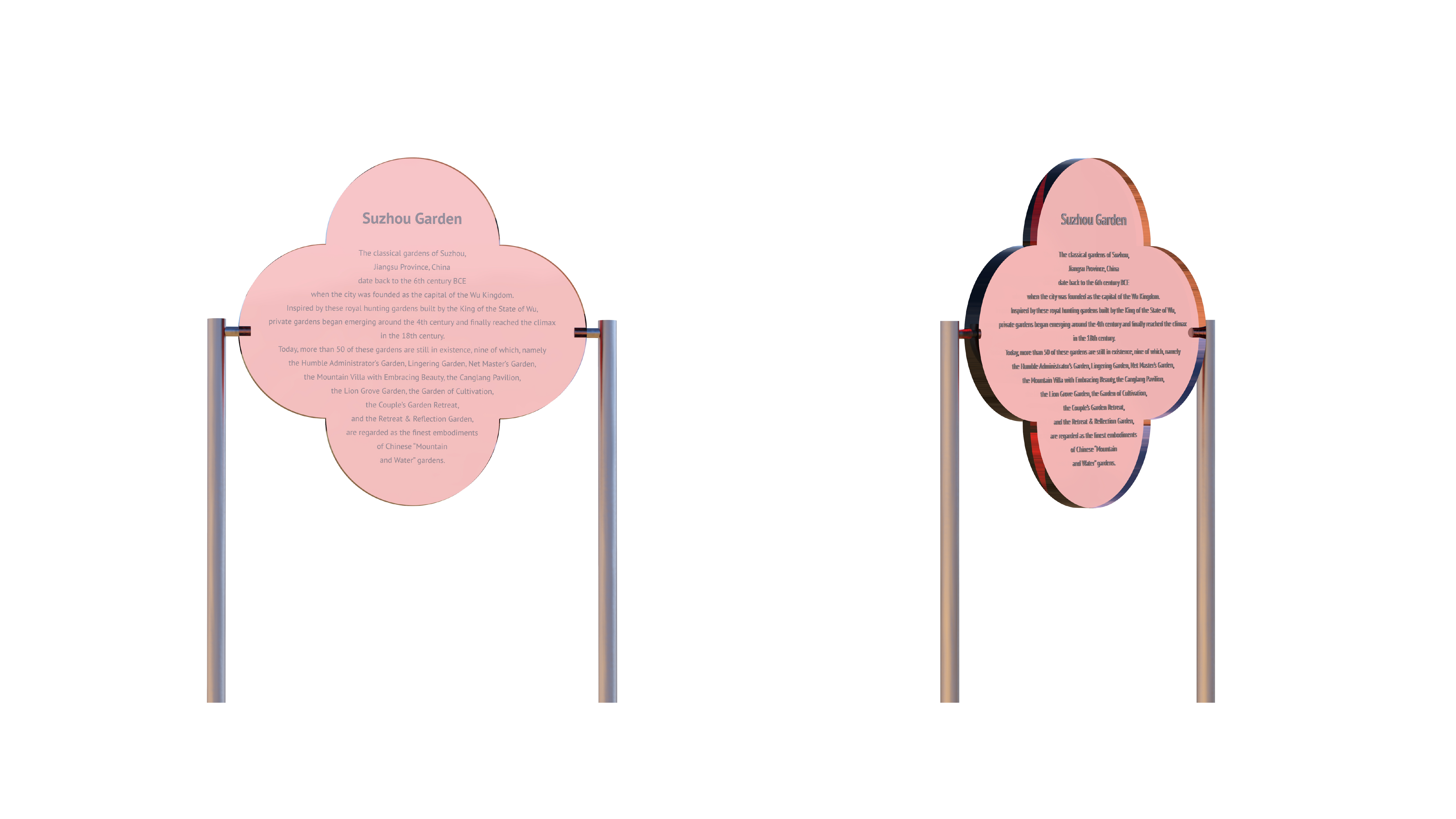
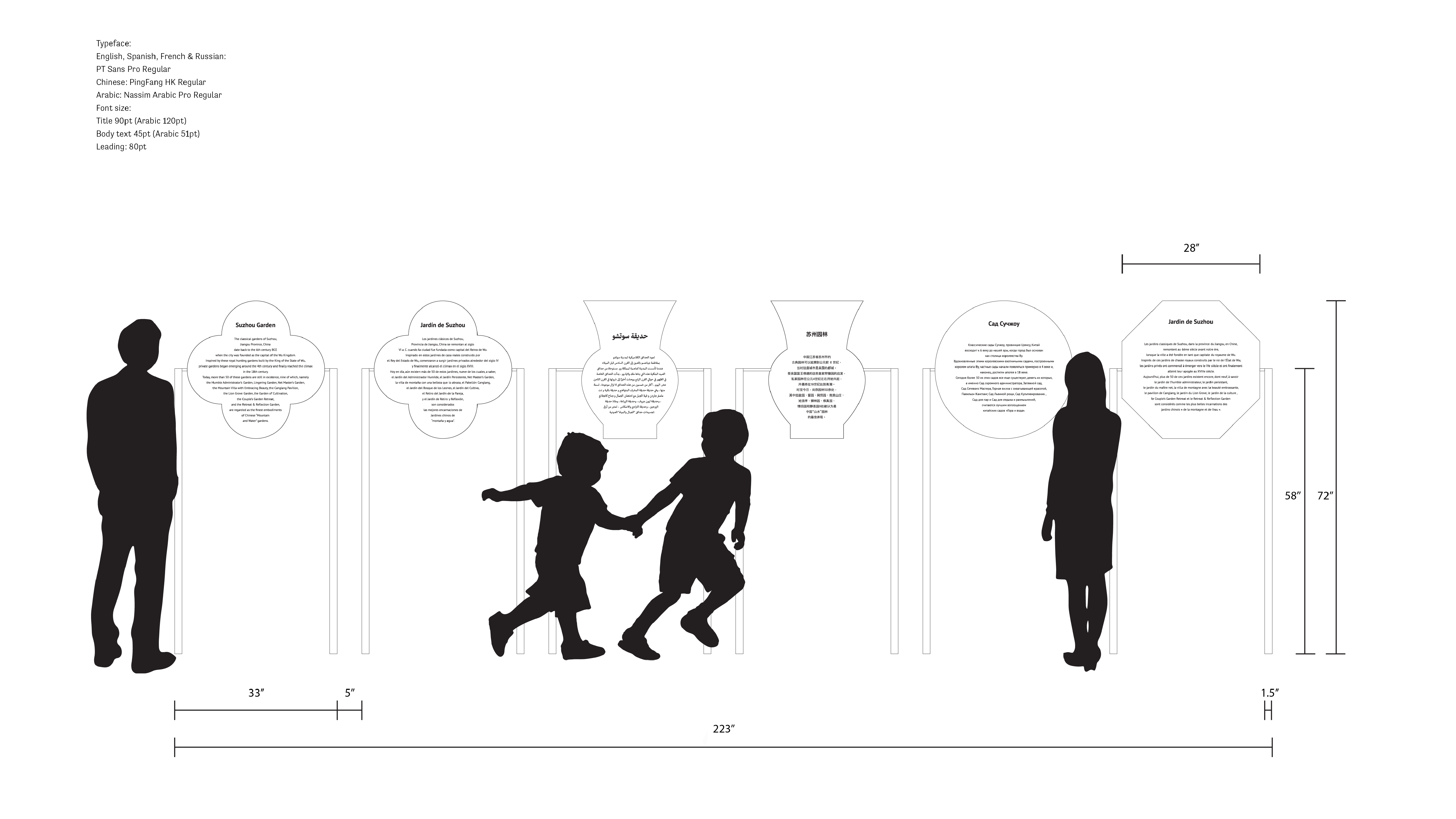
Site sign
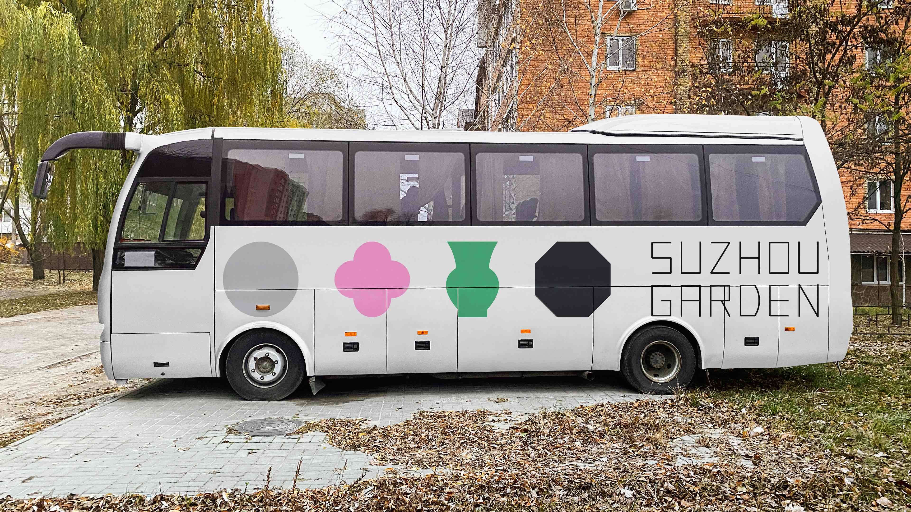 Vehicle design
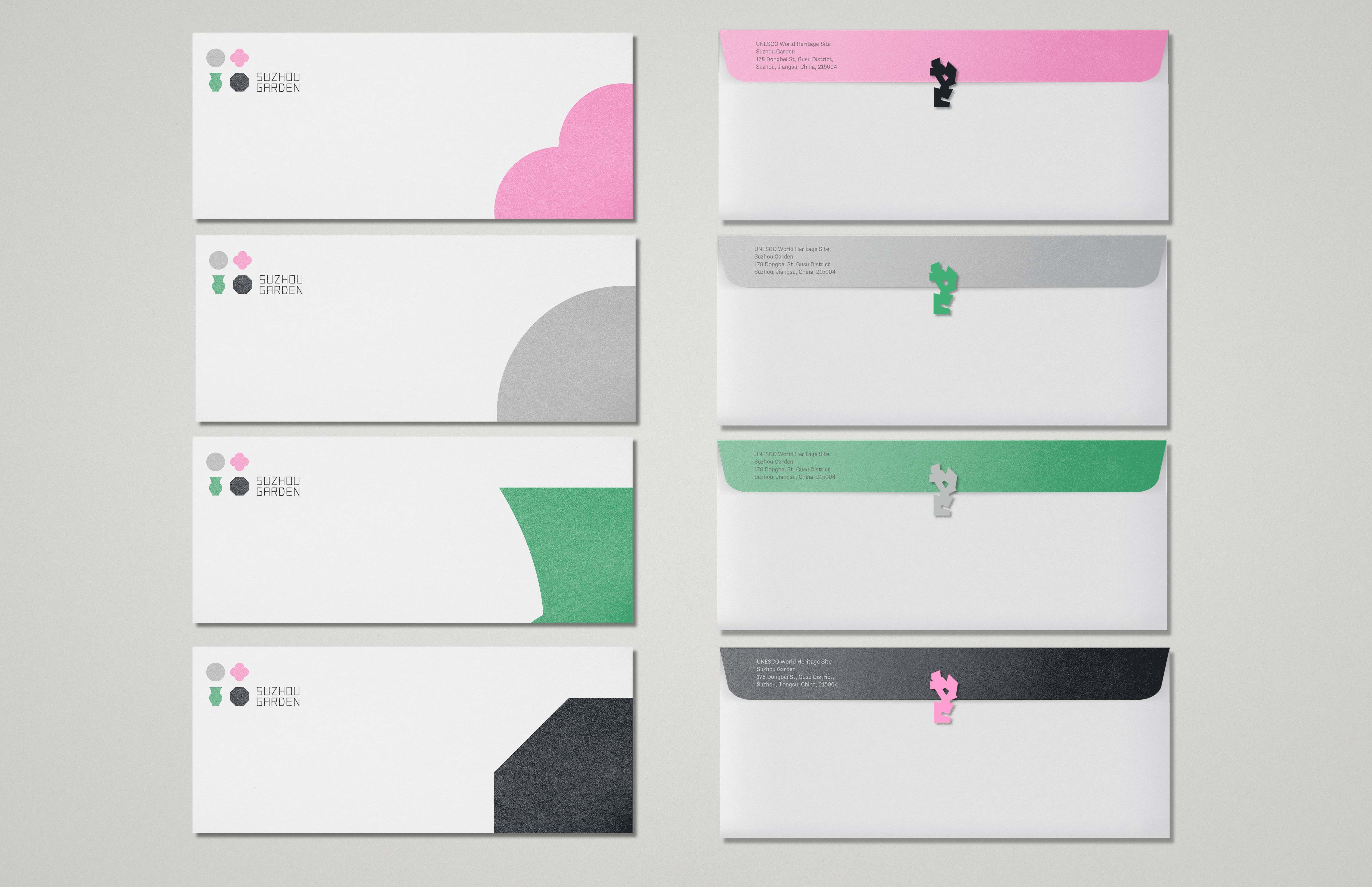
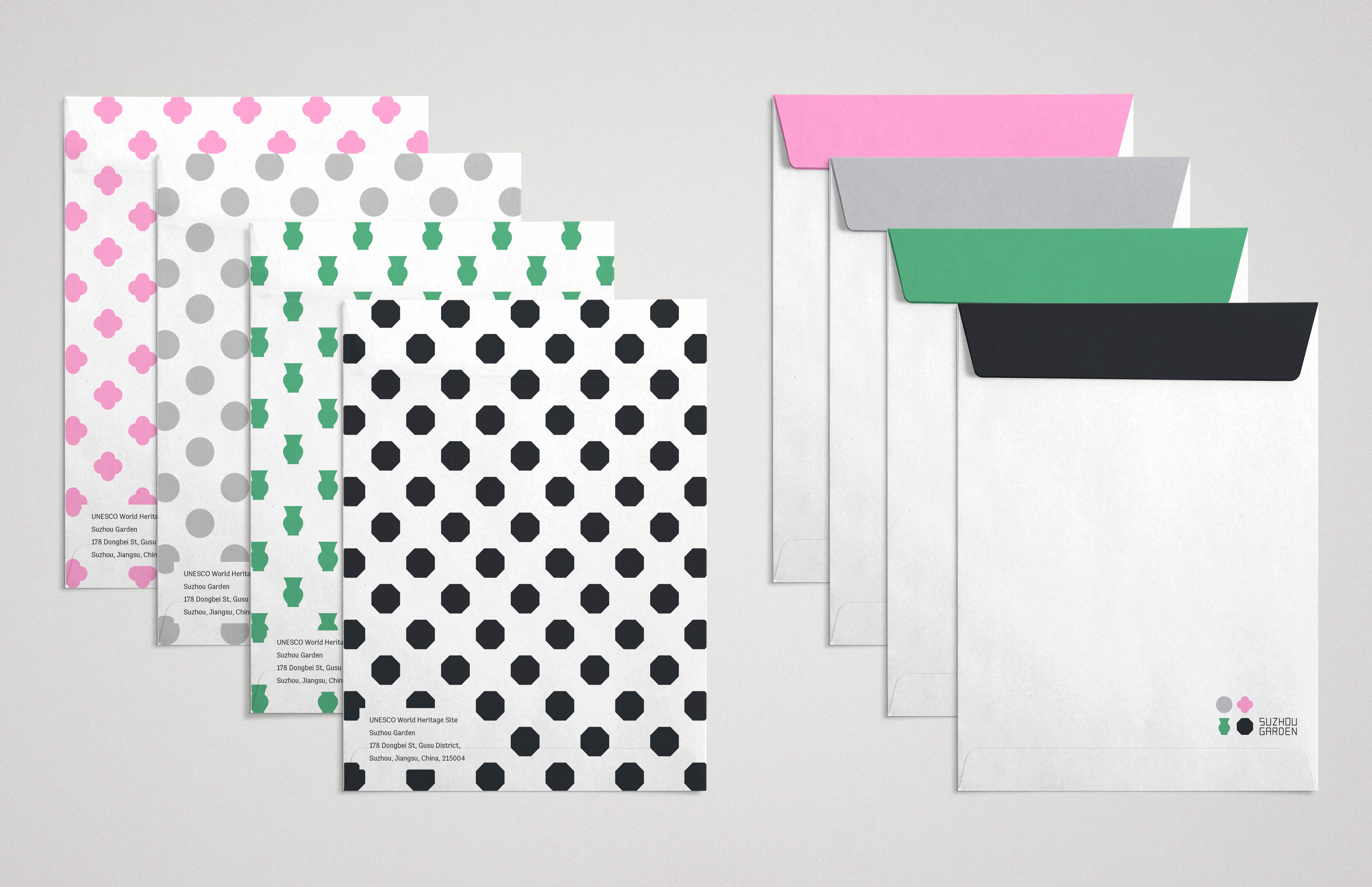
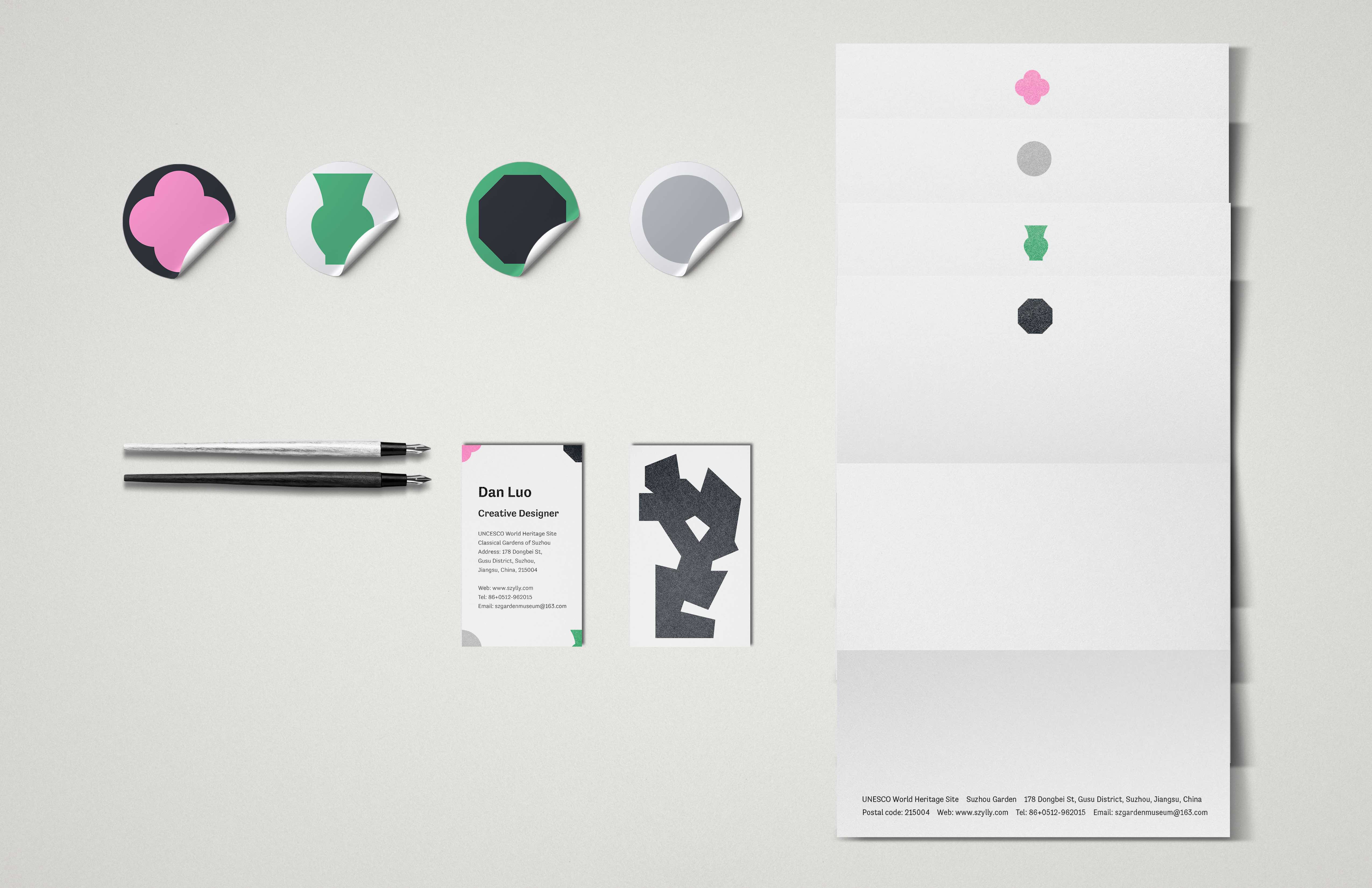
Stationery design
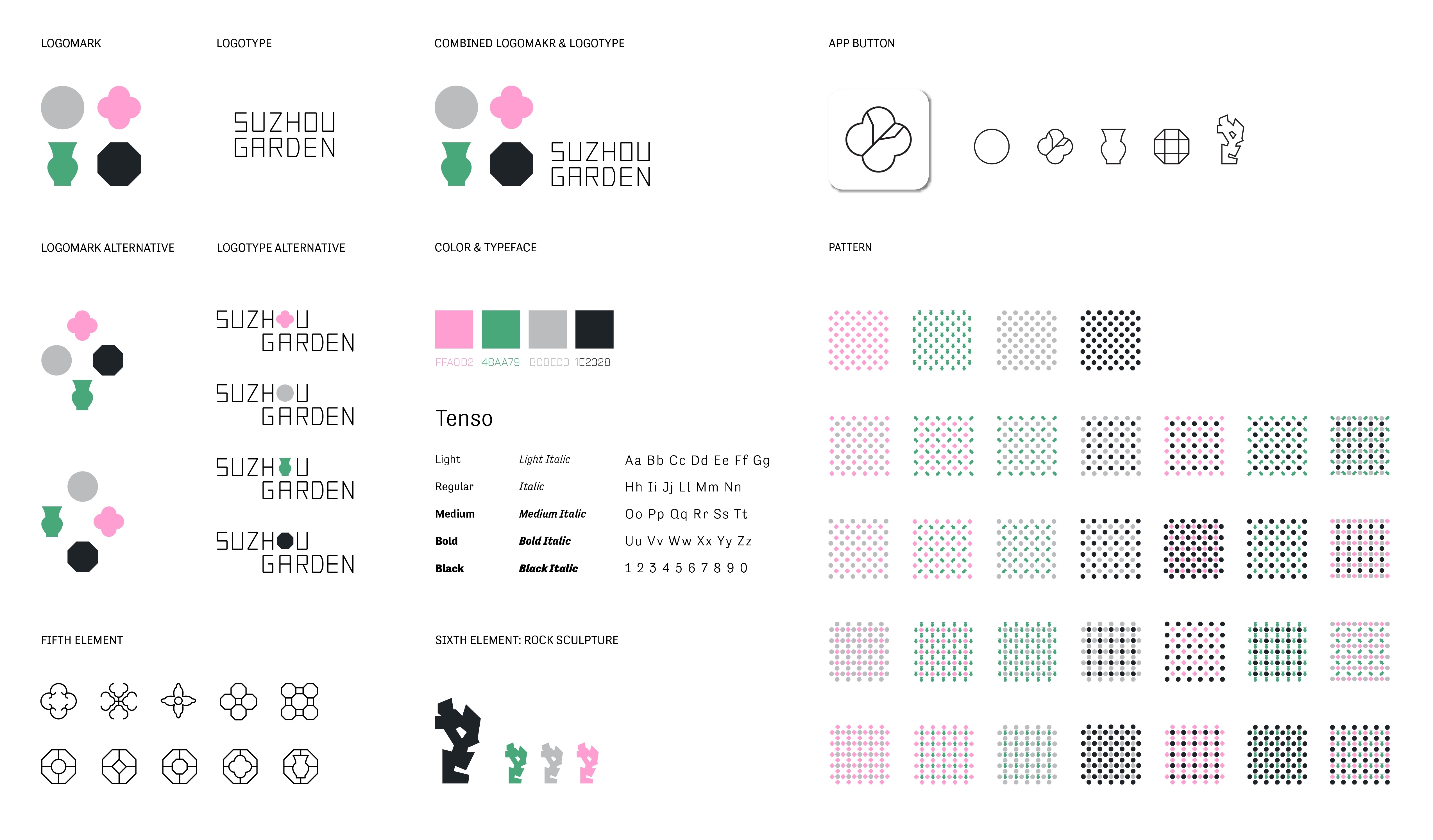 Visual guide
Design process
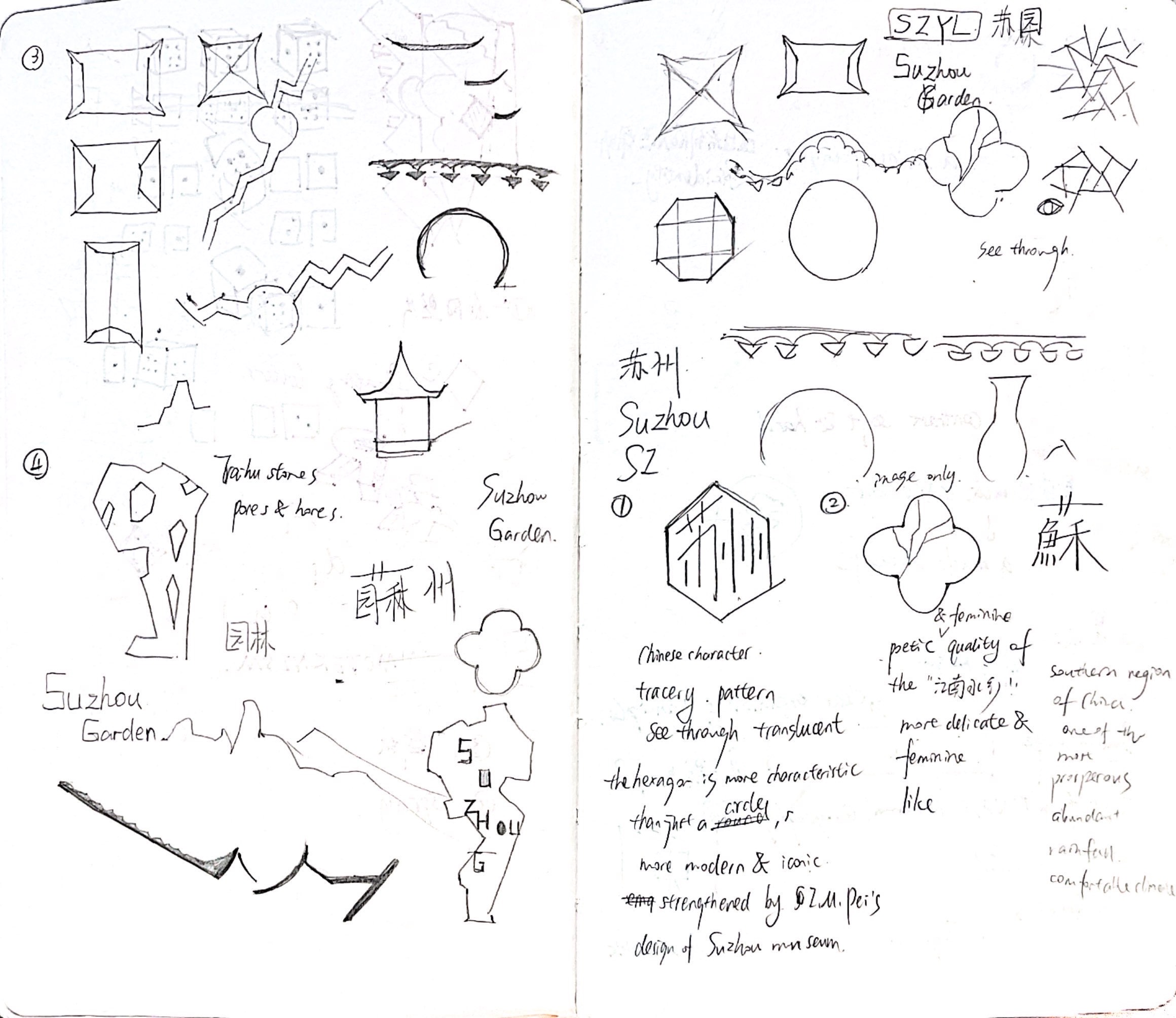
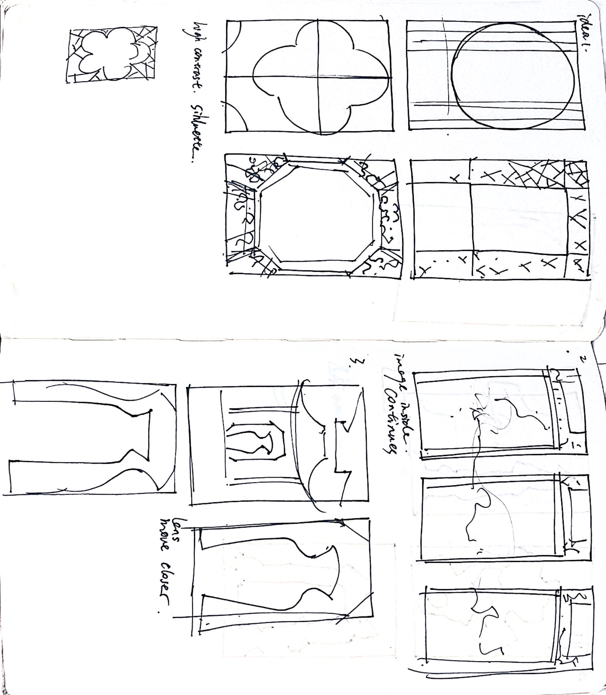
1. Analyze the existing logo

The existing logo for Suzhou Garden on the official website.
There is no record of its designer and design intention.
The existing mark for Suzhou Garden uses a simplified image of a pavilion in the center, which has no special feature to distinguish itself from other pavilions in China. However, the abstract circle around it and the bars on the bottom took me a bit time to figure out what it is. I didn’t understand it until I saw this photo.
![]()
The reason for me to not understand the logo immediately (even though I am familiar with and has been to Suzhou Garden) is that the perspective shown in this photo is not “landmark” enough to represent Suzhou Garden. The bars, which I think represent the railings, are not necessary to appear in the logo, since they have no symbolic meaning and feel redundant. The only possibility I can come up with to explain the bars is that they represent water, which is an important design element in Suzhou Garden. However, the bars are to rigid to represent water(they look more like railings).

The reason for me to not understand the logo immediately (even though I am familiar with and has been to Suzhou Garden) is that the perspective shown in this photo is not “landmark” enough to represent Suzhou Garden. The bars, which I think represent the railings, are not necessary to appear in the logo, since they have no symbolic meaning and feel redundant. The only possibility I can come up with to explain the bars is that they represent water, which is an important design element in Suzhou Garden. However, the bars are to rigid to represent water(they look more like railings).
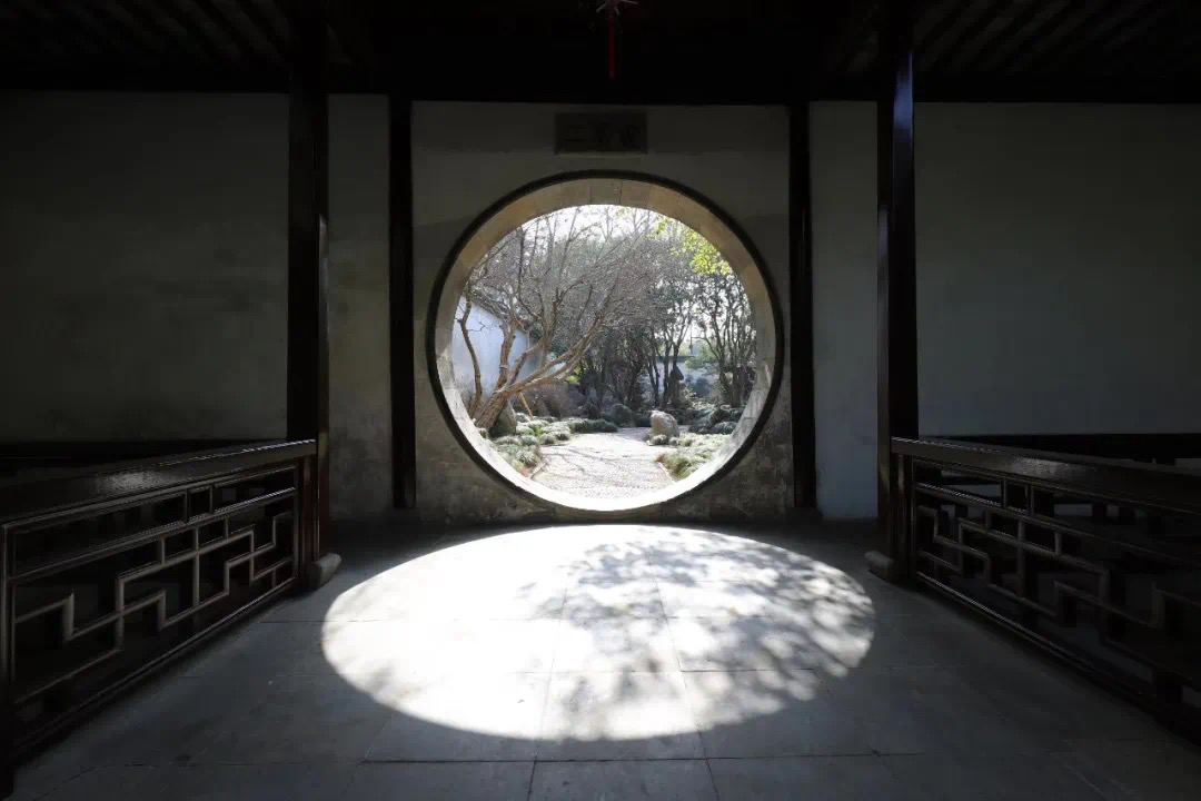
 A maze-like exploring experience. Views change at every step.
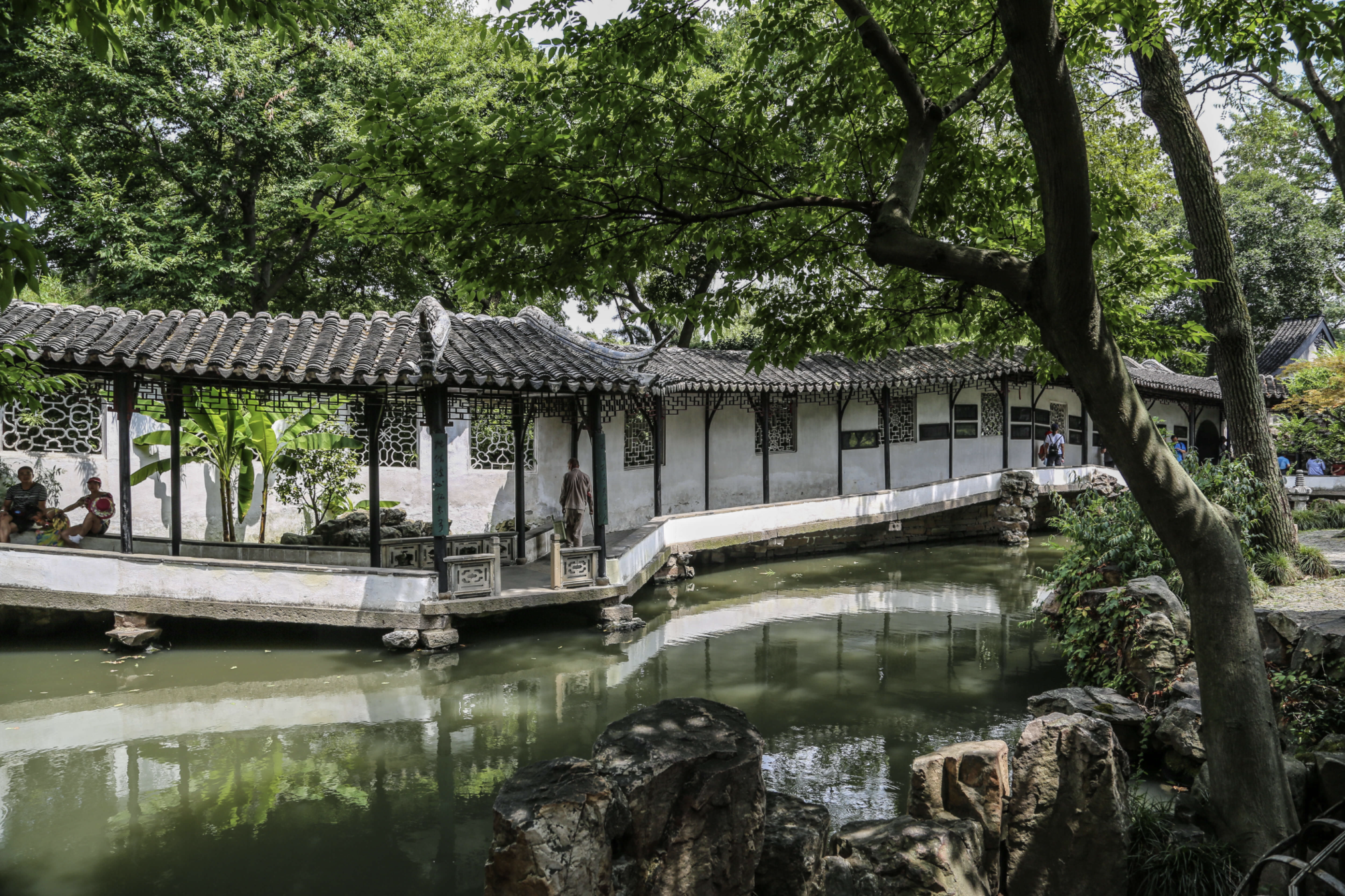
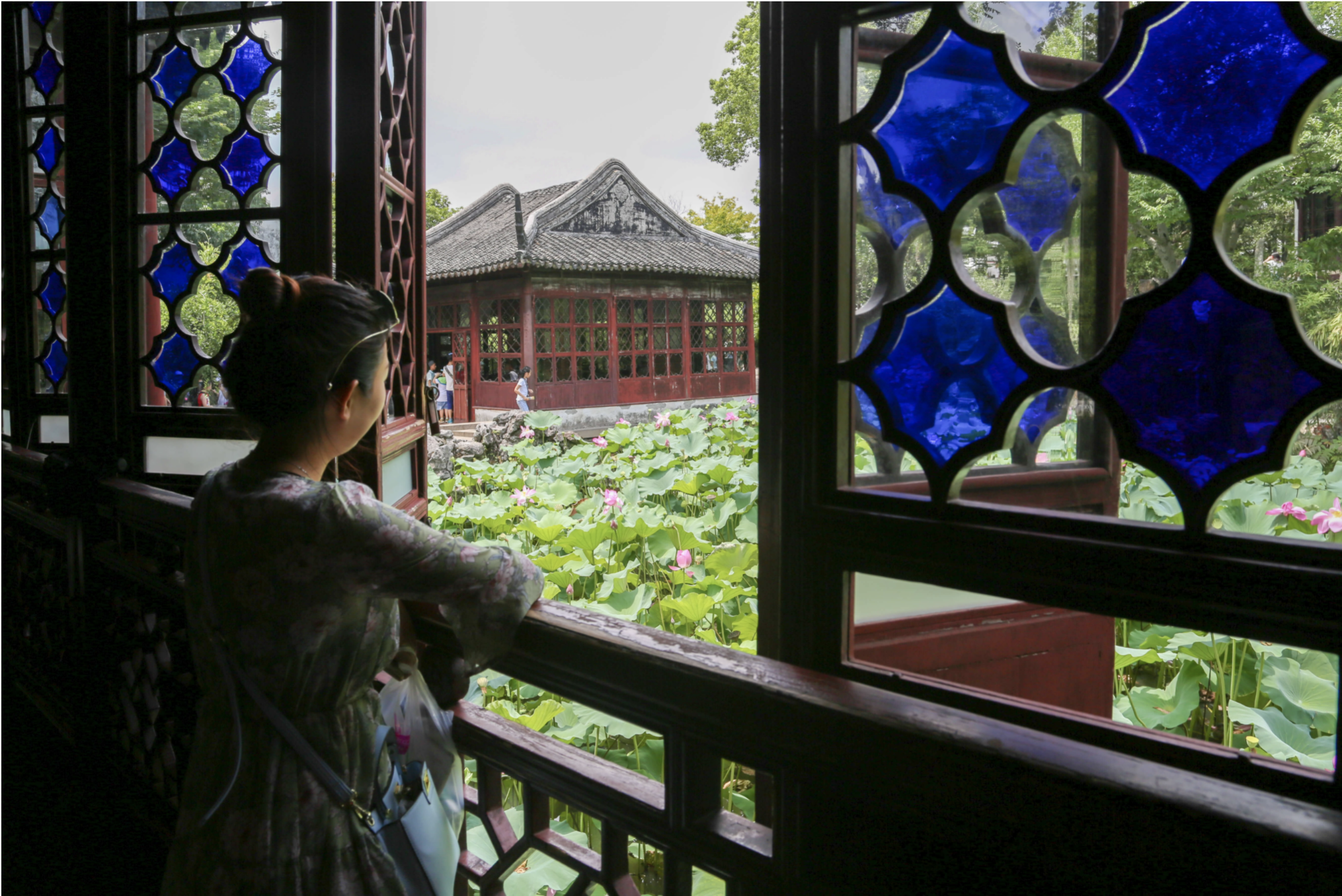
 Alhough the original logo is confusing, it does capture a key point of Suzhou Garden — looking through perforated windows or walking through ornamental gates to enjoy the scenery. Ancient Chinese designed the gardens with their own philosophy and aesthetics. Different from traditional Western garden design, which is symmetrical and a completely open space, Chinese gardens values asymmetry and an immsersed exlporing experience. Walking in Suzhou Garden is like wandering in a maze. Views will change at every step and the windows and gates help frame the sceneries like paintings. When you leave Suzhou Garden, the most memorable moments must be the views celebrated by the windows and gates.
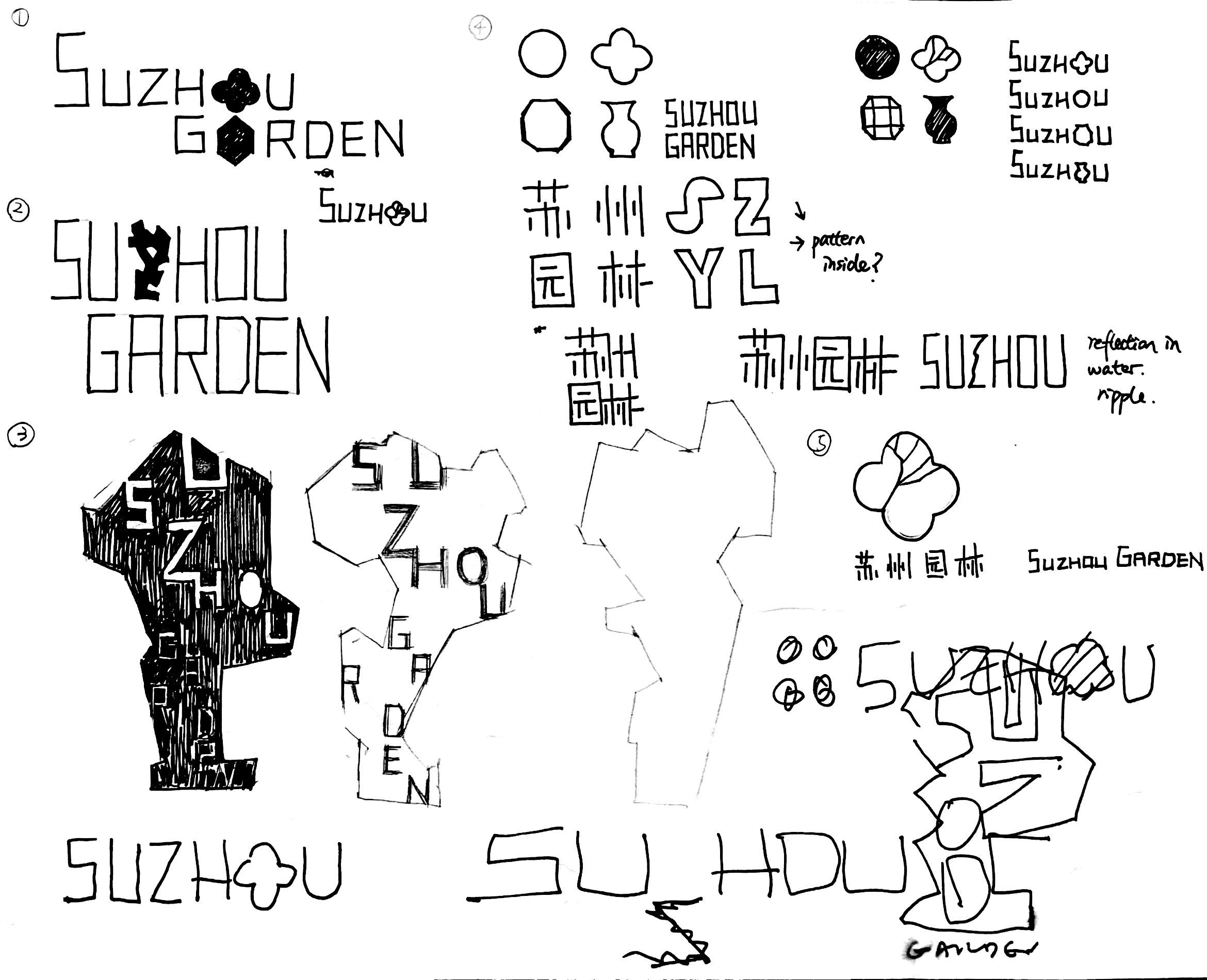
2. Develope my idea
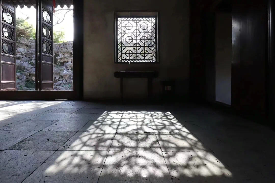
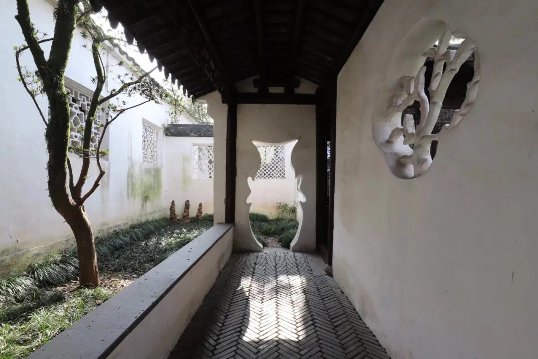


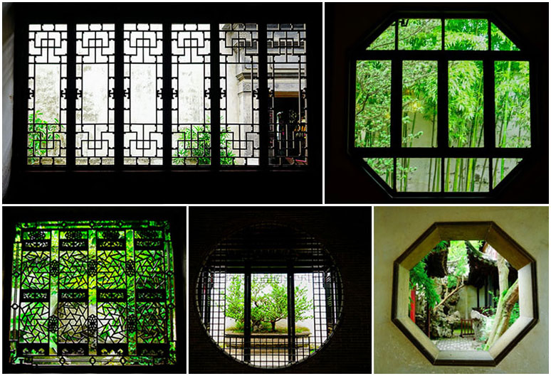

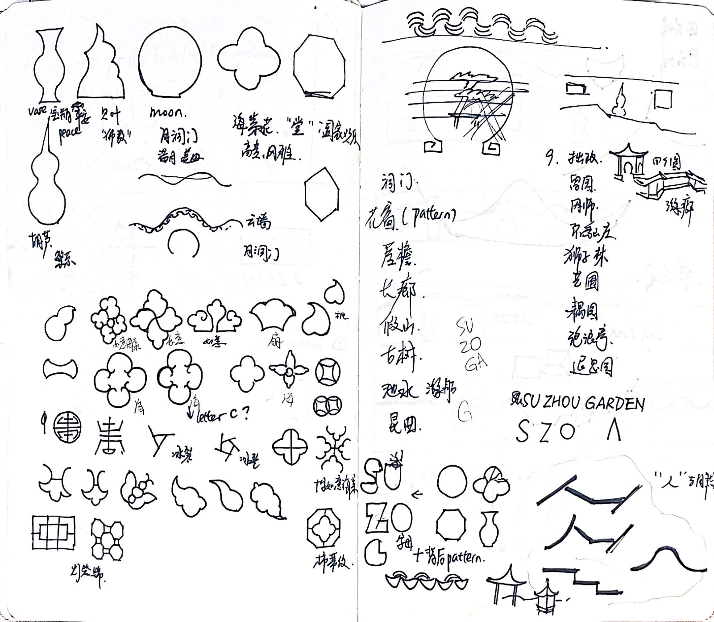
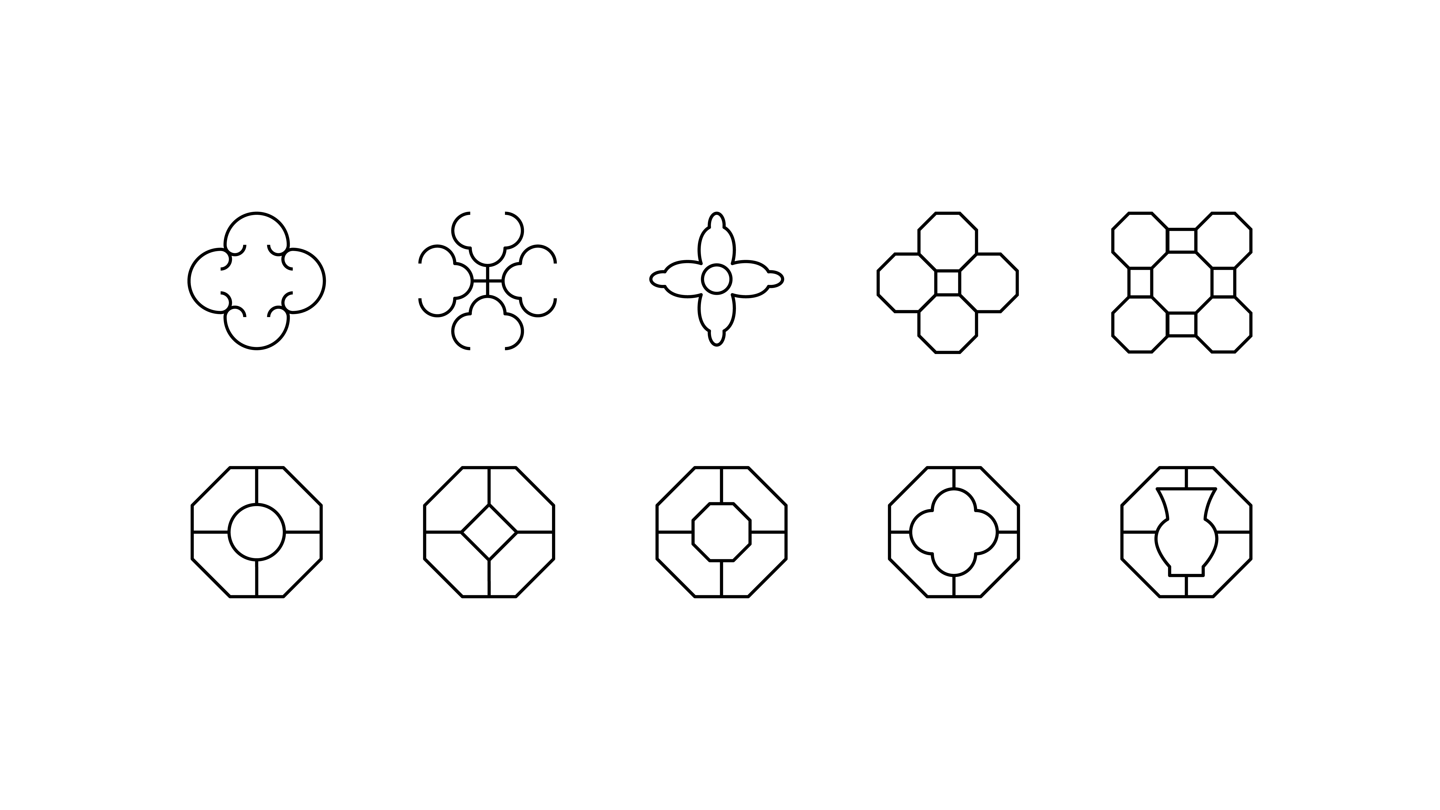
Therefore, between the symbolic elements I listed out that represent Suzhou Garden, such as pavilion, upturned eave, and rock scuptures, I decided to use the ornamental windows and gates. (Everything else is included in them, isn’t it?) Acting like the eyes of the building complex, they are so carefully designed with unique shapes and delicate patterns that carry strong cultural connotations. And between the numerous shapes and patterns, I chose four most common and memorable ones.
The circle represents a full moon and thus 圆满 (perfection and fullfillment). The flower shape represents begonia, which stands for elegance and 四世同堂 (a blessed multi-generational house). The vase shape means 平平安安 (healthy and safe), while the octagon means 四通八达(socially connected and inclusive). These all express the garden owners’ wishes and spiritual world.
The circle represents a full moon and thus 圆满 (perfection and fullfillment). The flower shape represents begonia, which stands for elegance and 四世同堂 (a blessed multi-generational house). The vase shape means 平平安安 (healthy and safe), while the octagon means 四通八达(socially connected and inclusive). These all express the garden owners’ wishes and spiritual world.
 Fifth element
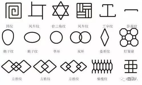
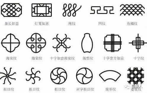
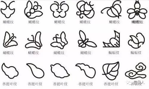
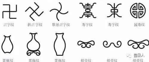
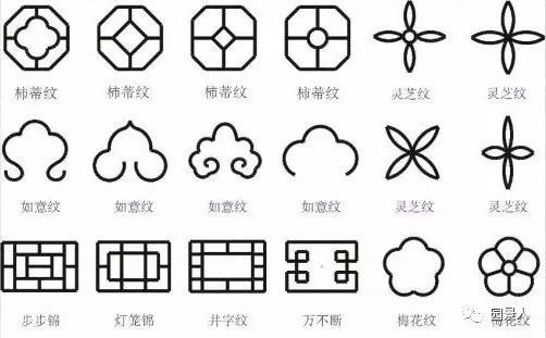
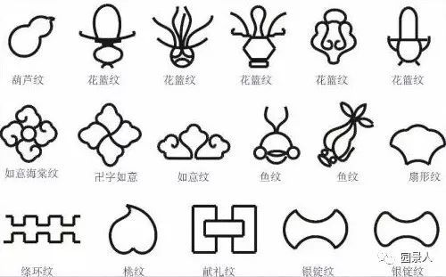
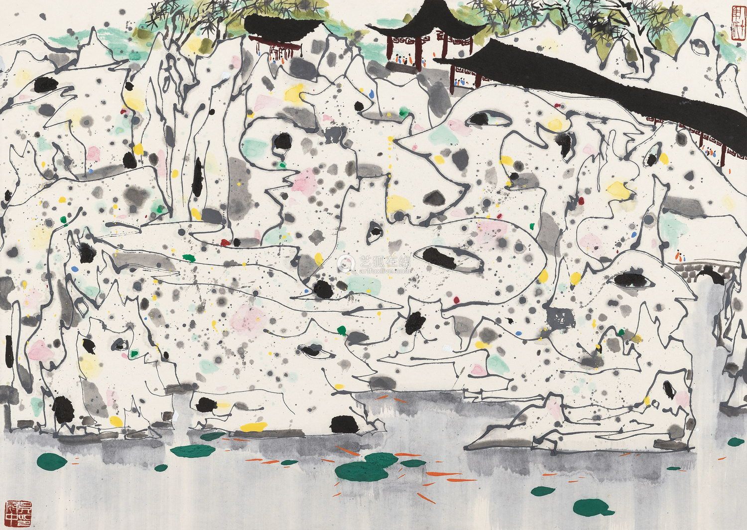
Research of the complex patterns in Suzhou Garden
For the fifth element, I chose to incorporate patterns that are more complex but still related to the main logo.
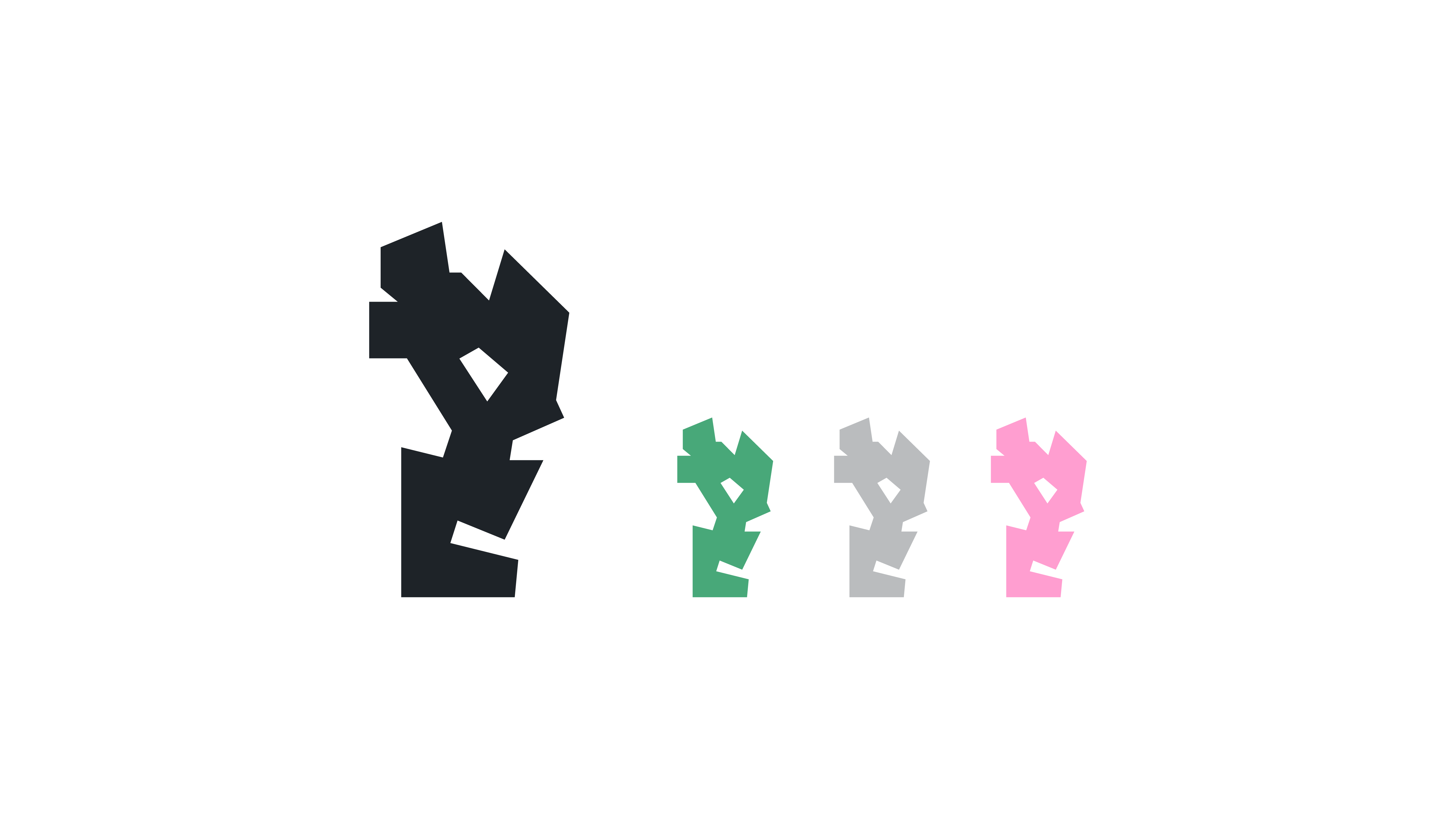 Sixth element
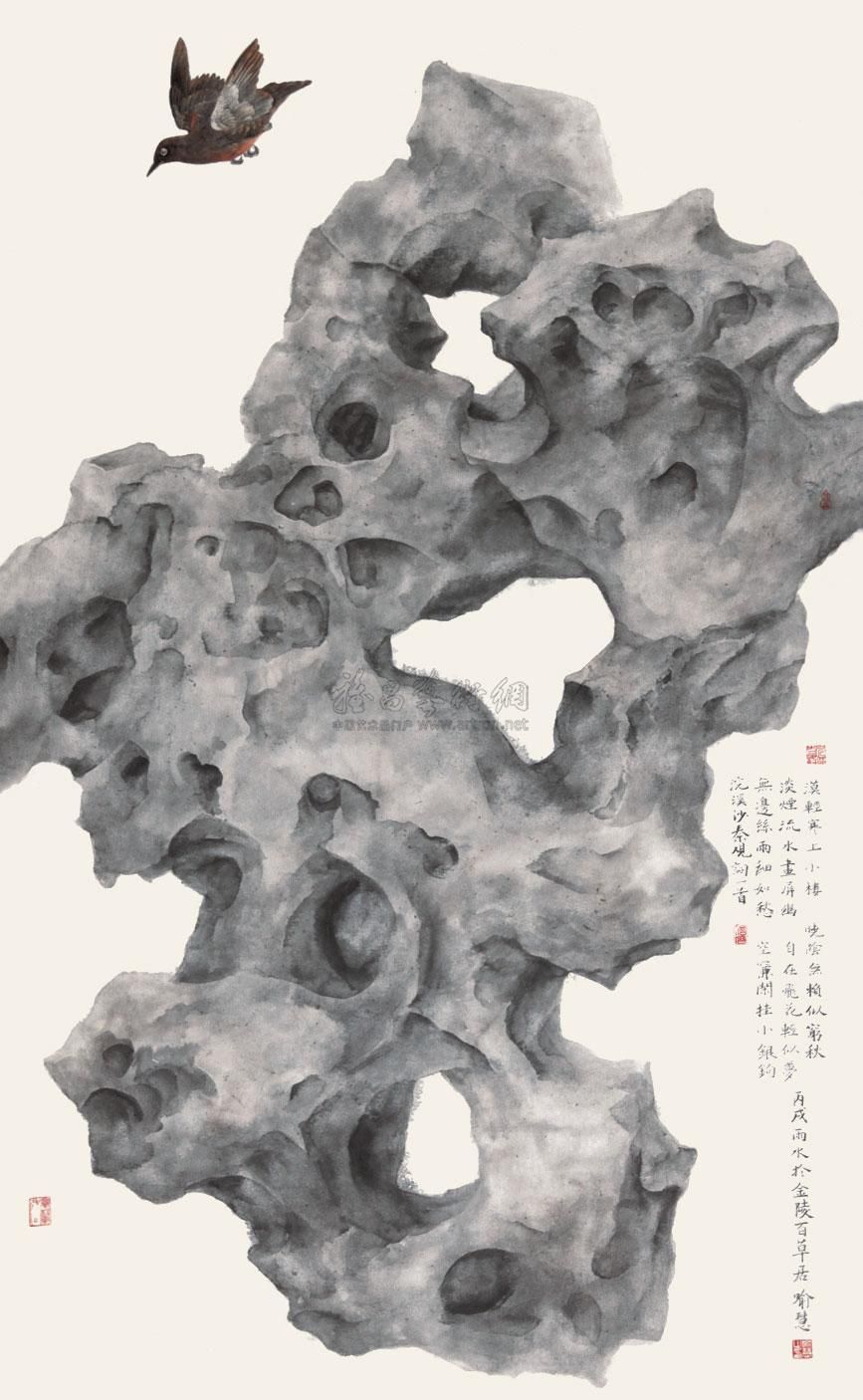
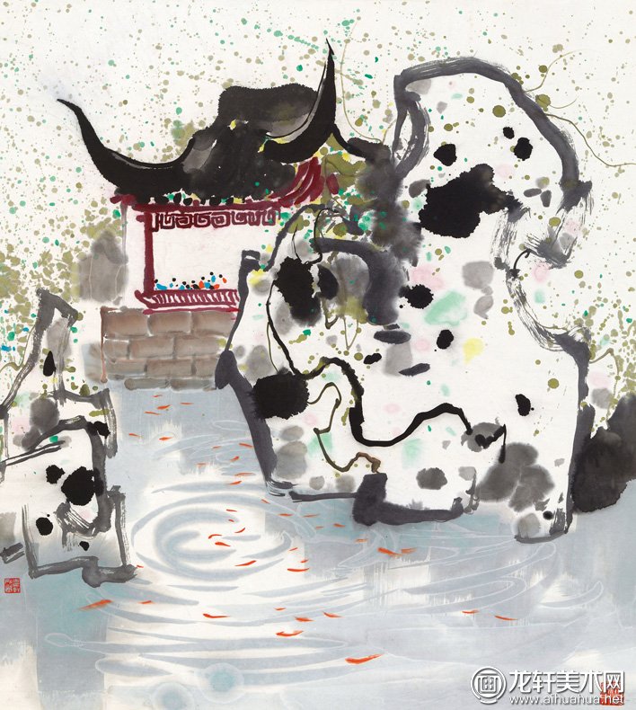
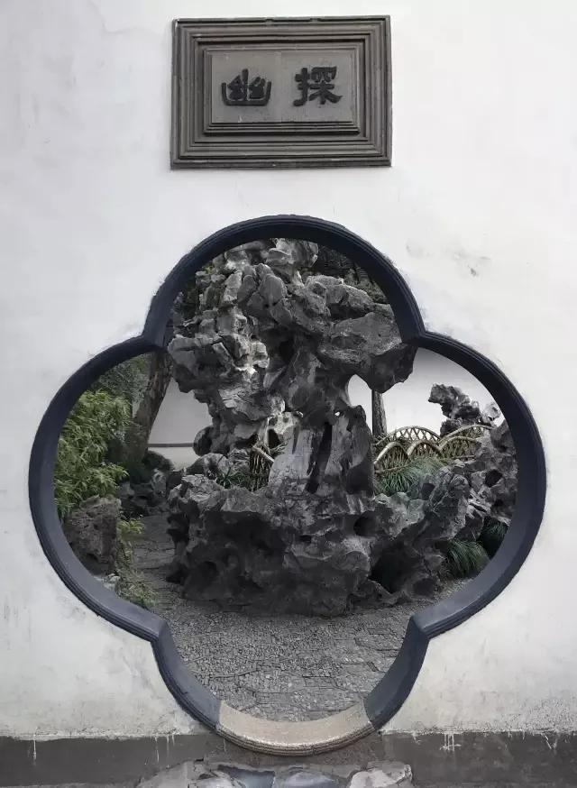
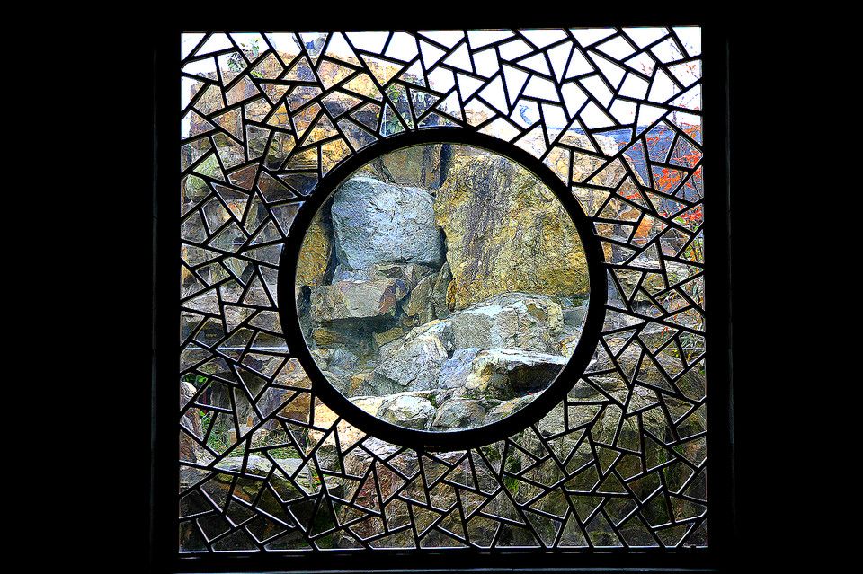
The sixth element is derived from the rock sculptures in the garden, which is another important aspect of Suzhou Garden.
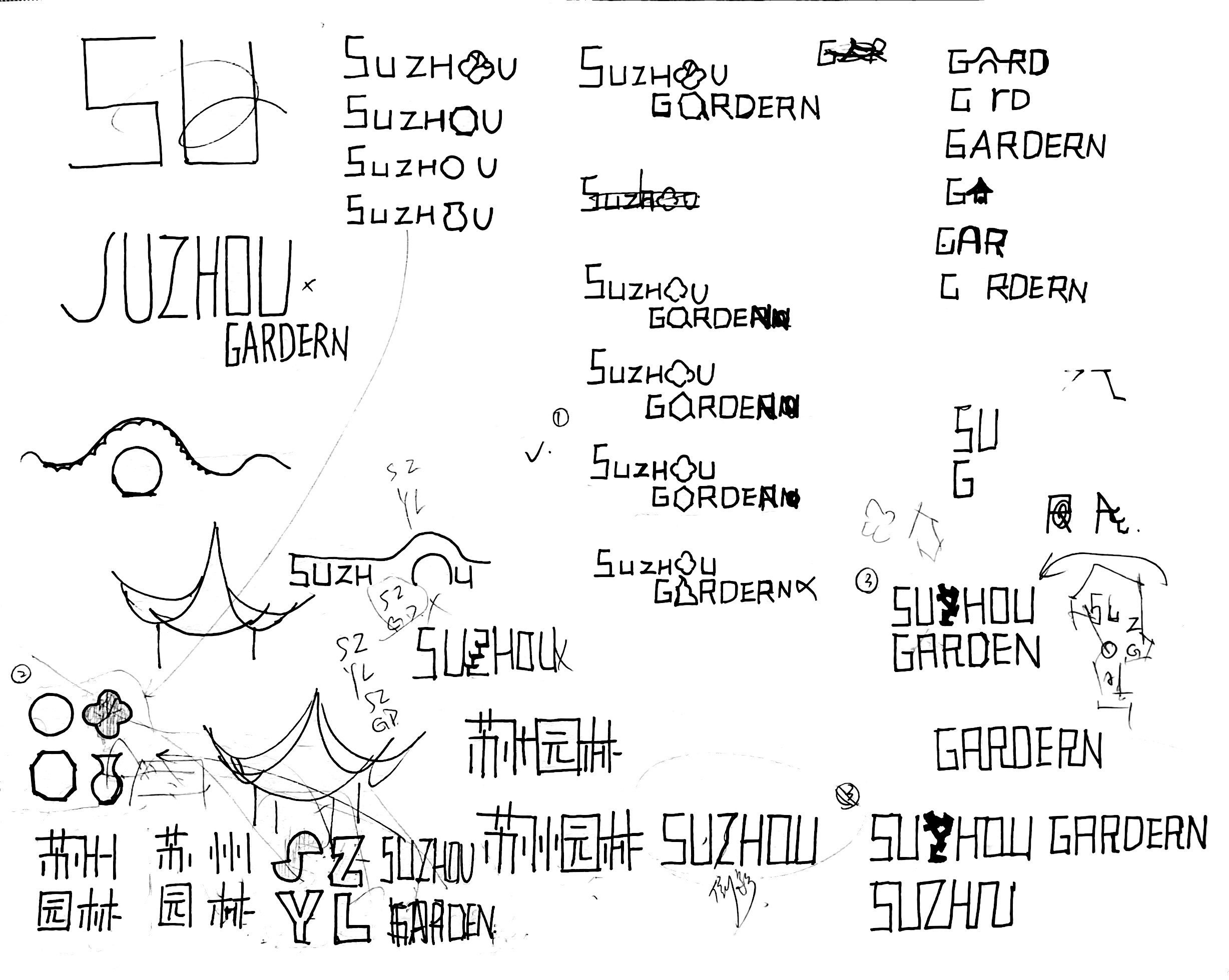
Sketches for the site sign and posters