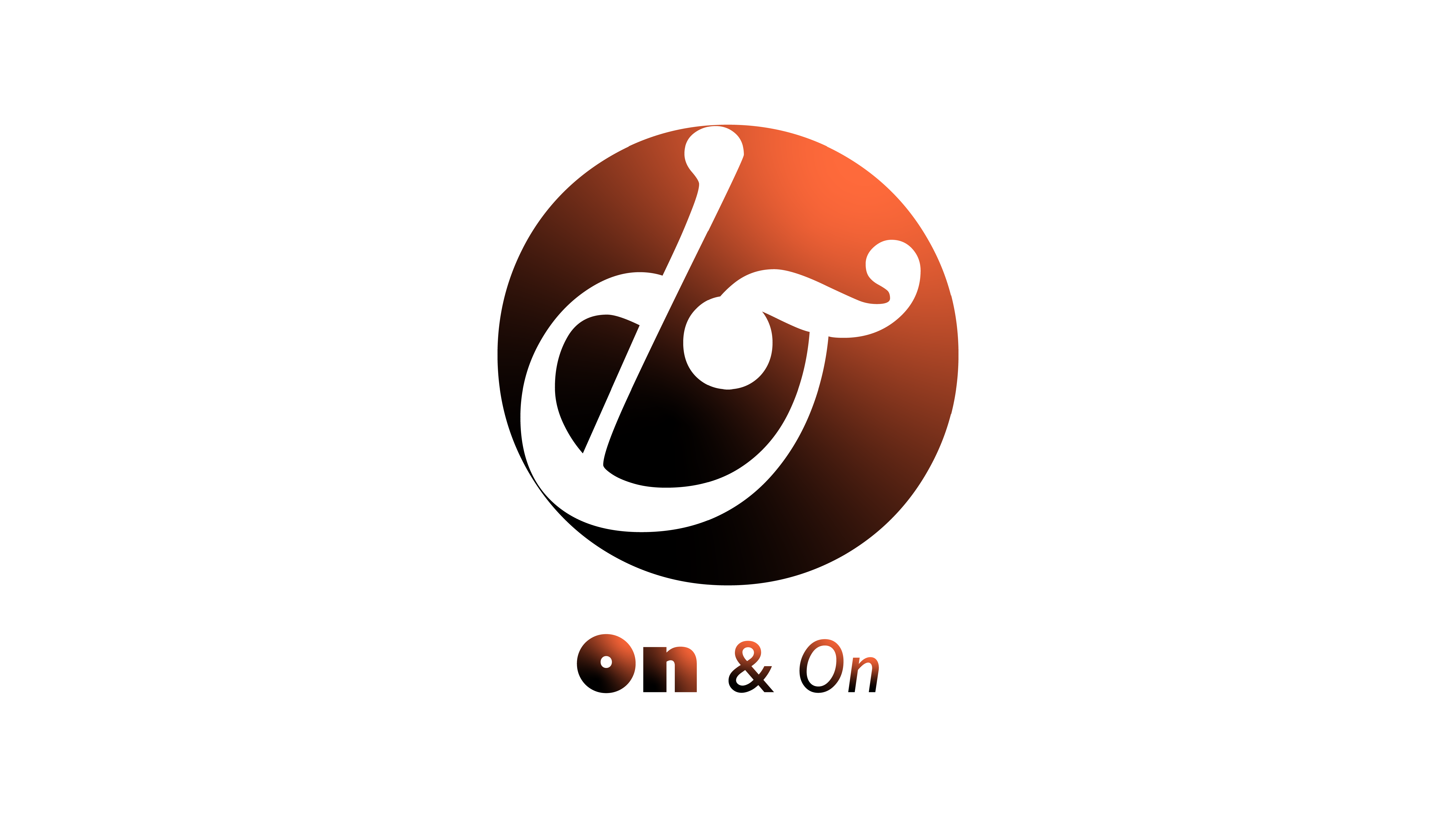
On & On
Mark Design, Motion
In this assignment, I practiced designing a single mark by combining two typographic characters.
Making Process

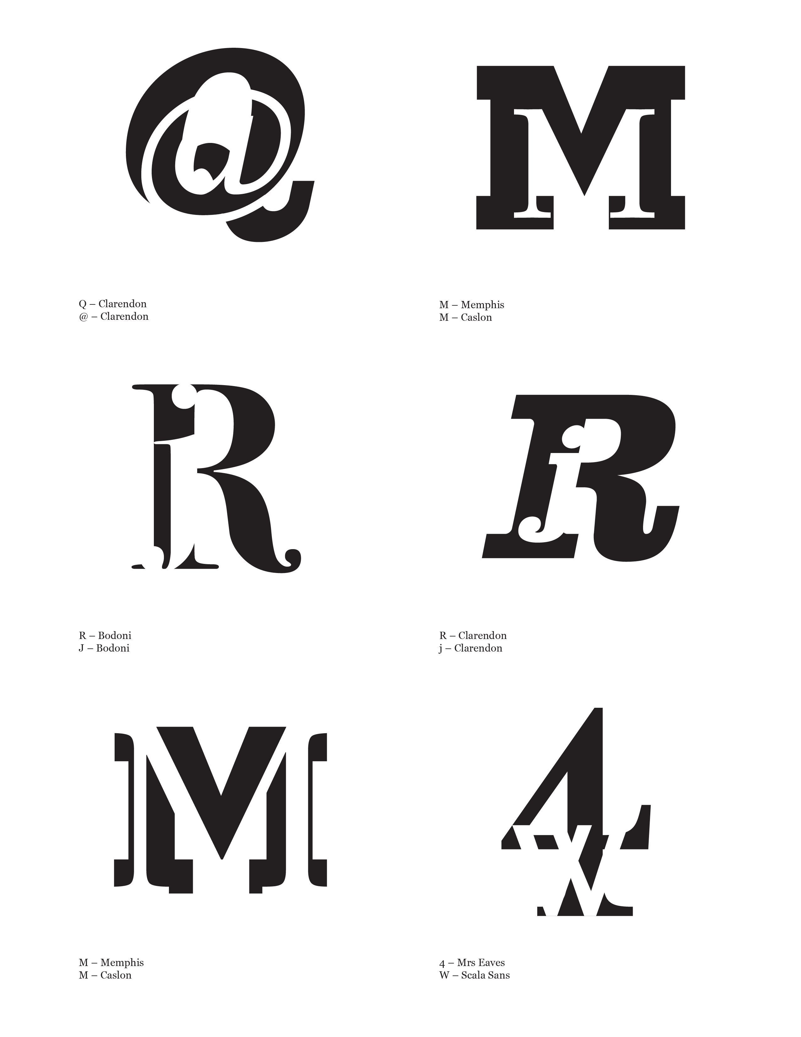
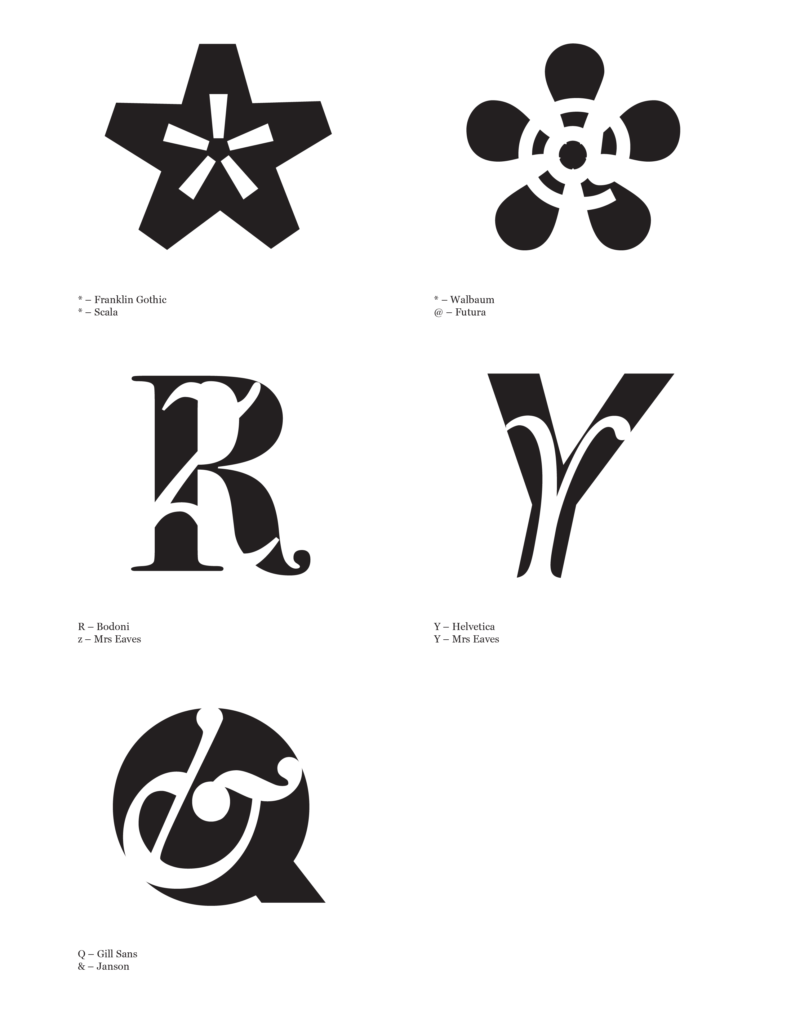

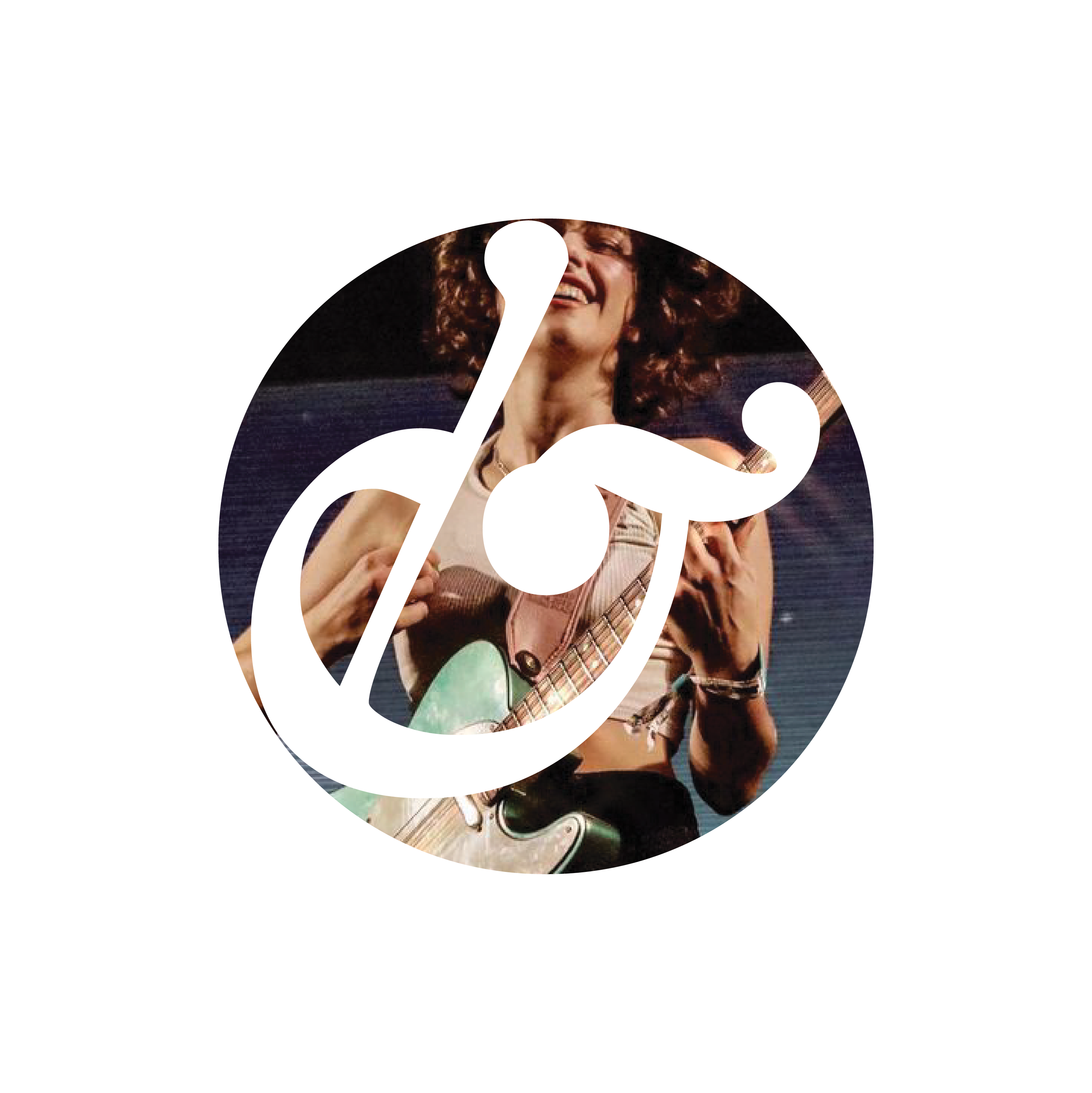
I started by playing with characters from different typefaces and finally chose the one made up with a Gill Sans “Q” and a Janson “&” for its balanced positive and negative shapes and its association with music and vinyal record player. Then I found the tail of the “Q” is visually redundant, so I replaced it with “O”, which makes the mark more simple, applicable, and readable at a small size.
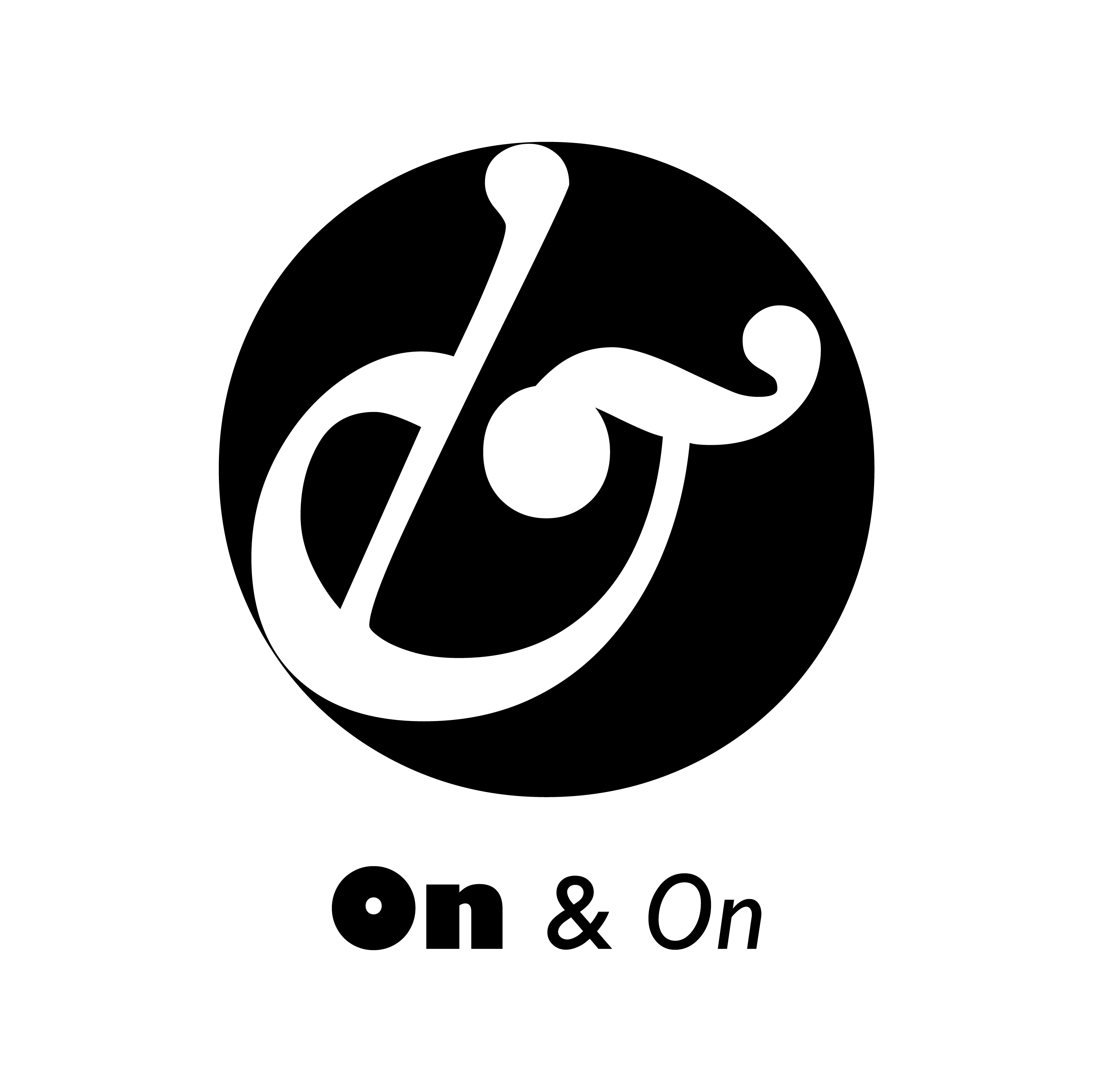
After I decided to use it as a logo for a music company, I came up with the name On & On to convery a sense of melody and continuity. I also found tens of songs using this name and chose Erykah Badu’s for the animated logo’s soundtrack.
Animation
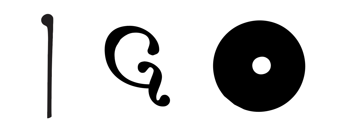
For the animation, I dissected the mark into three parts — a stylus, an ear, and a vinyl record.
When the music is on, the stylus touches the vinyl record and the ear shows up. The concept of the motion is to play and to listen continuously, echoing the company’s name On & On.
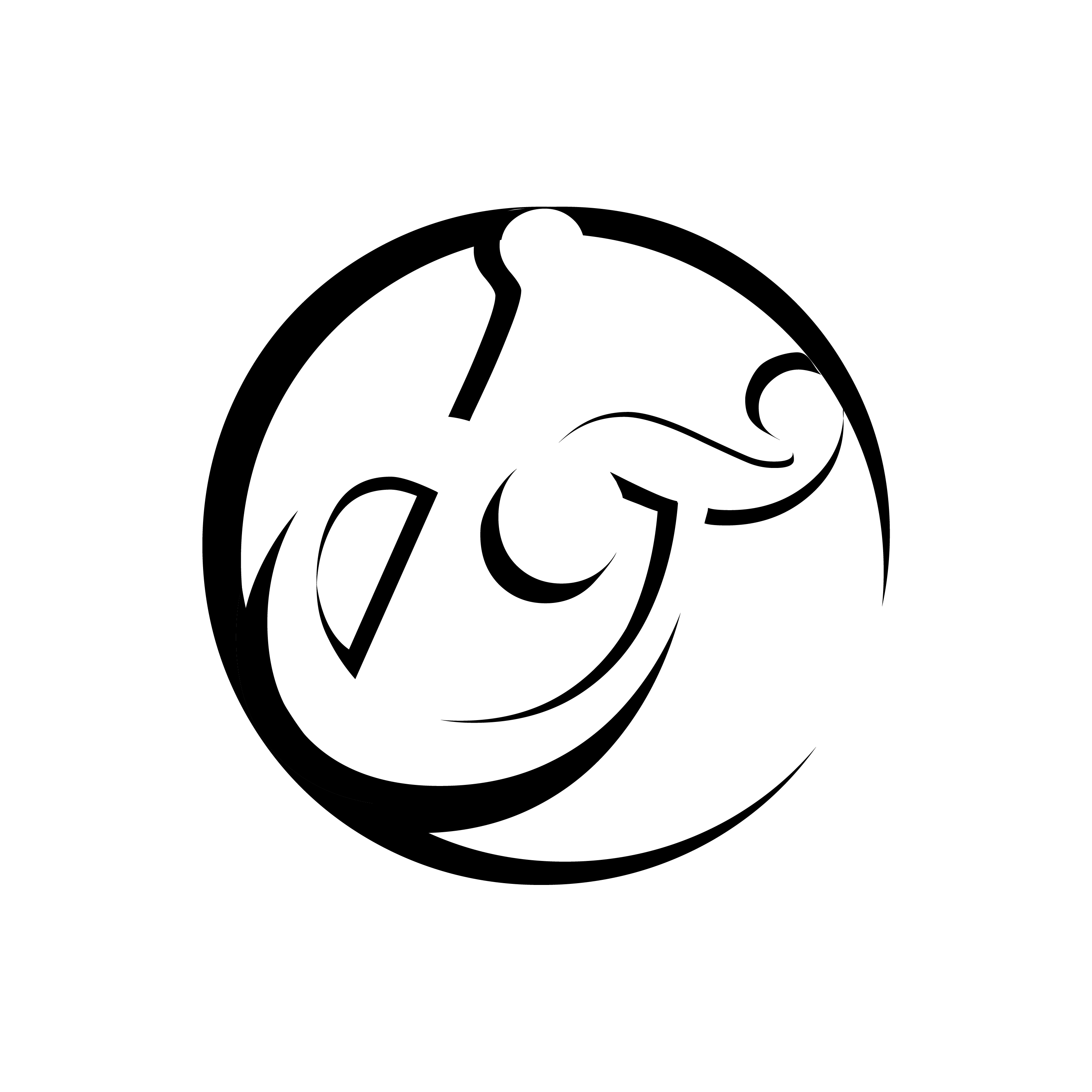
Variations