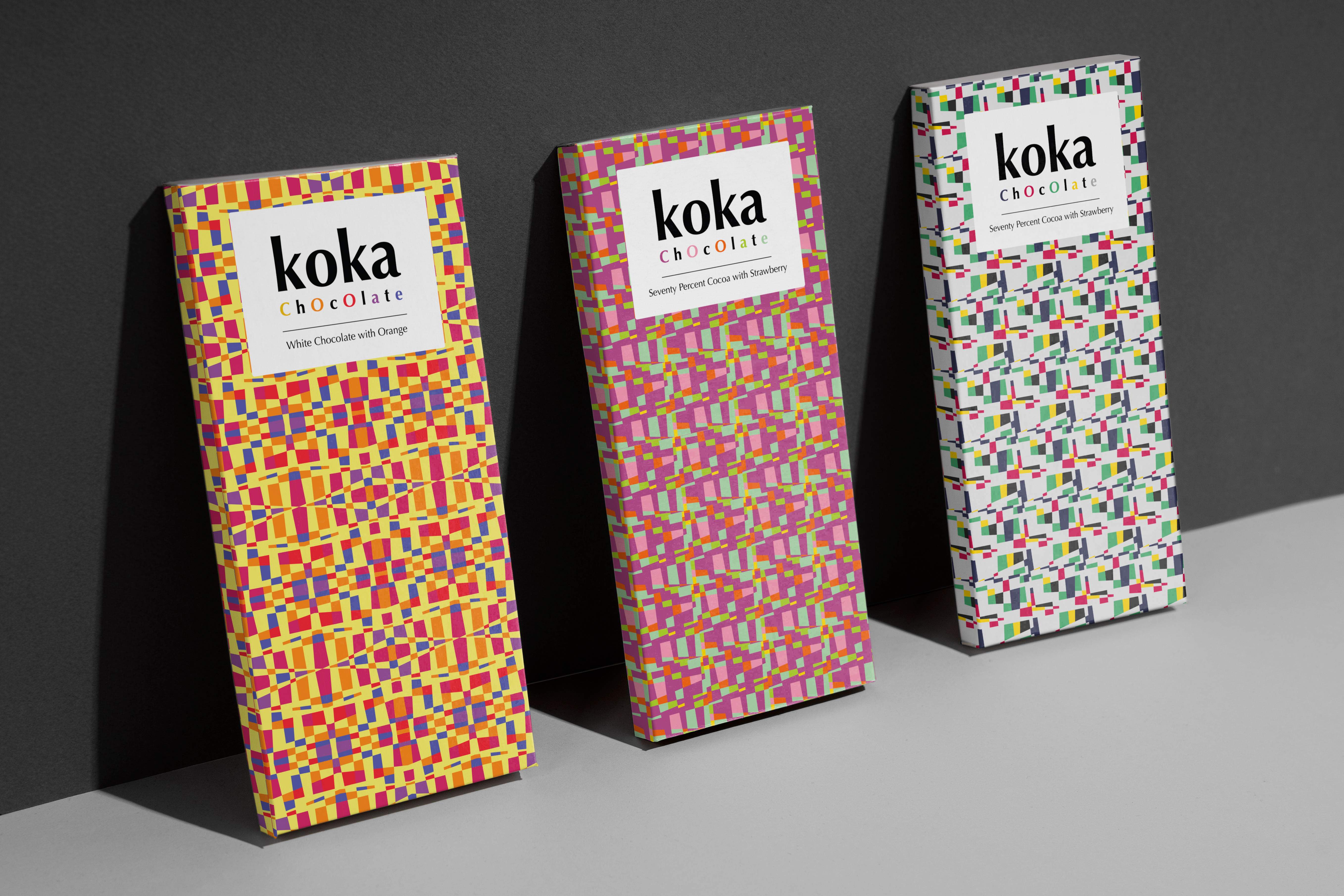
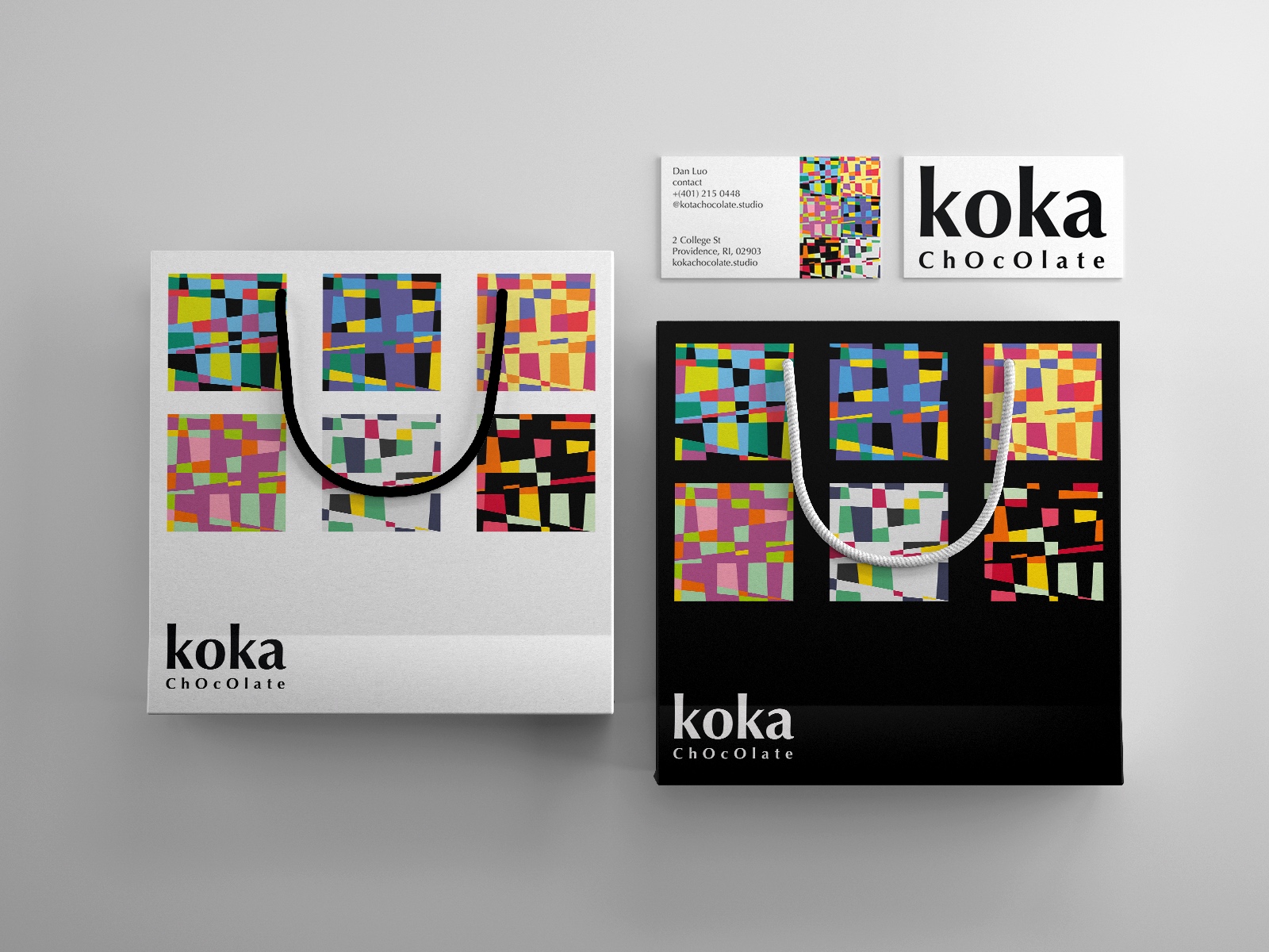
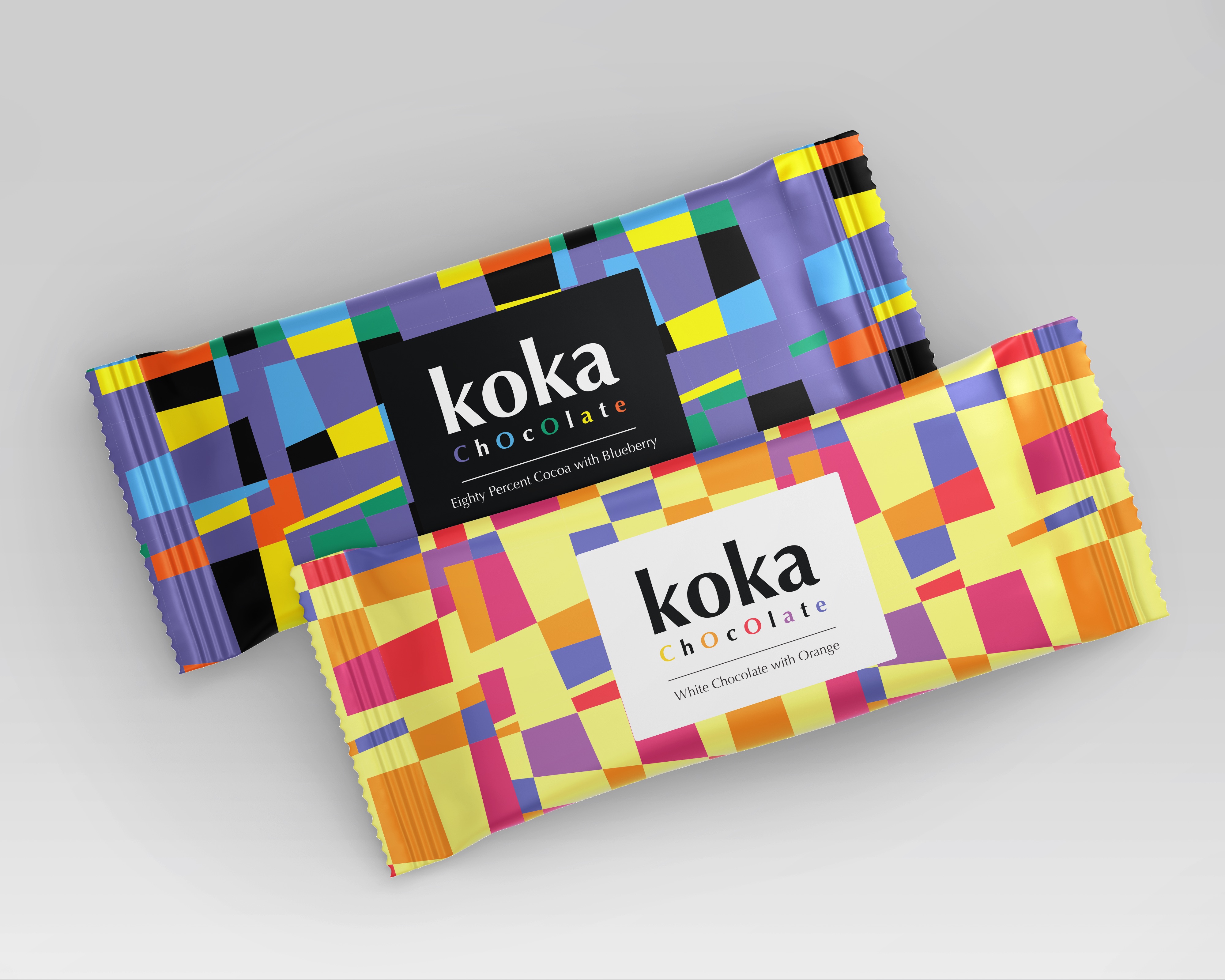
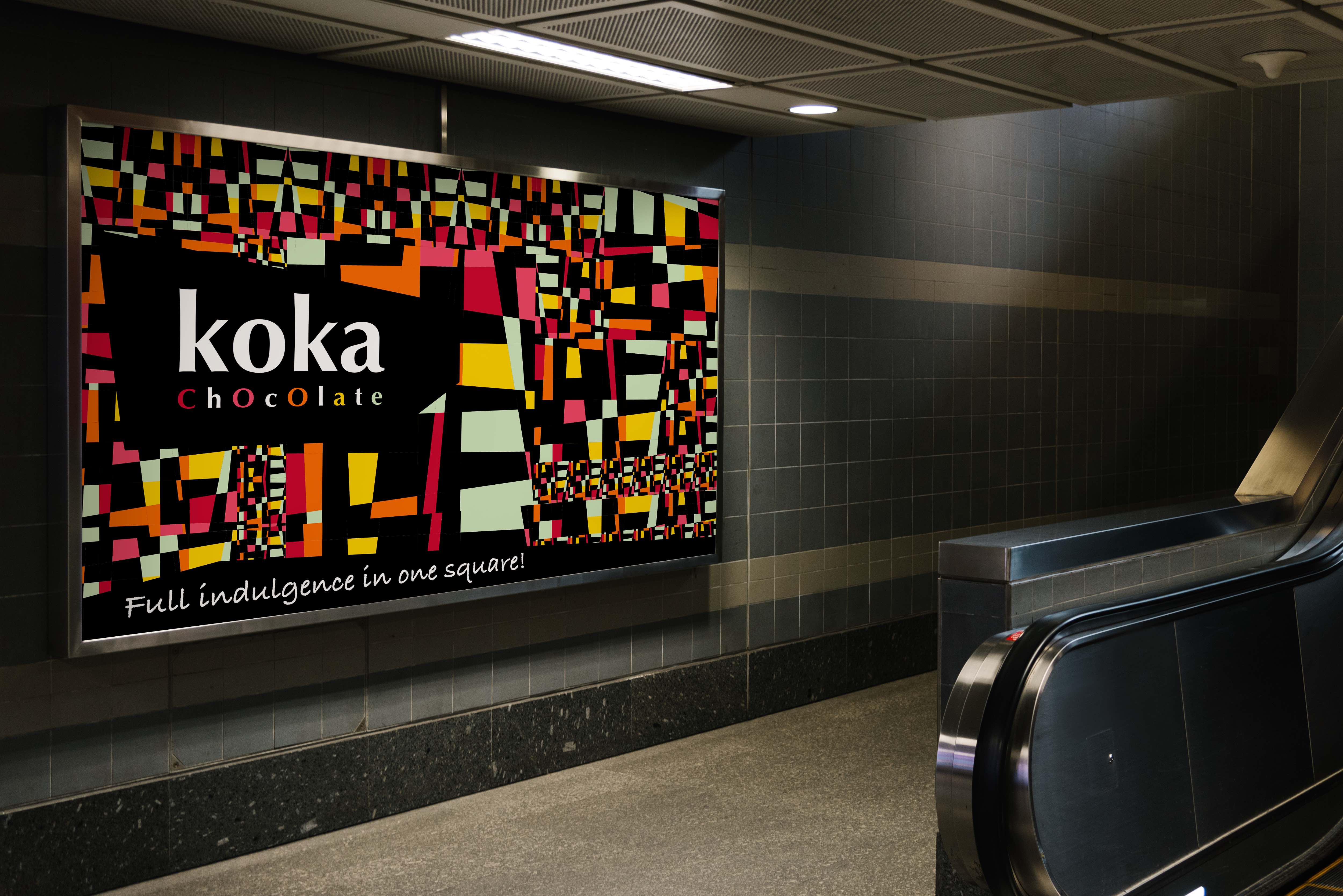
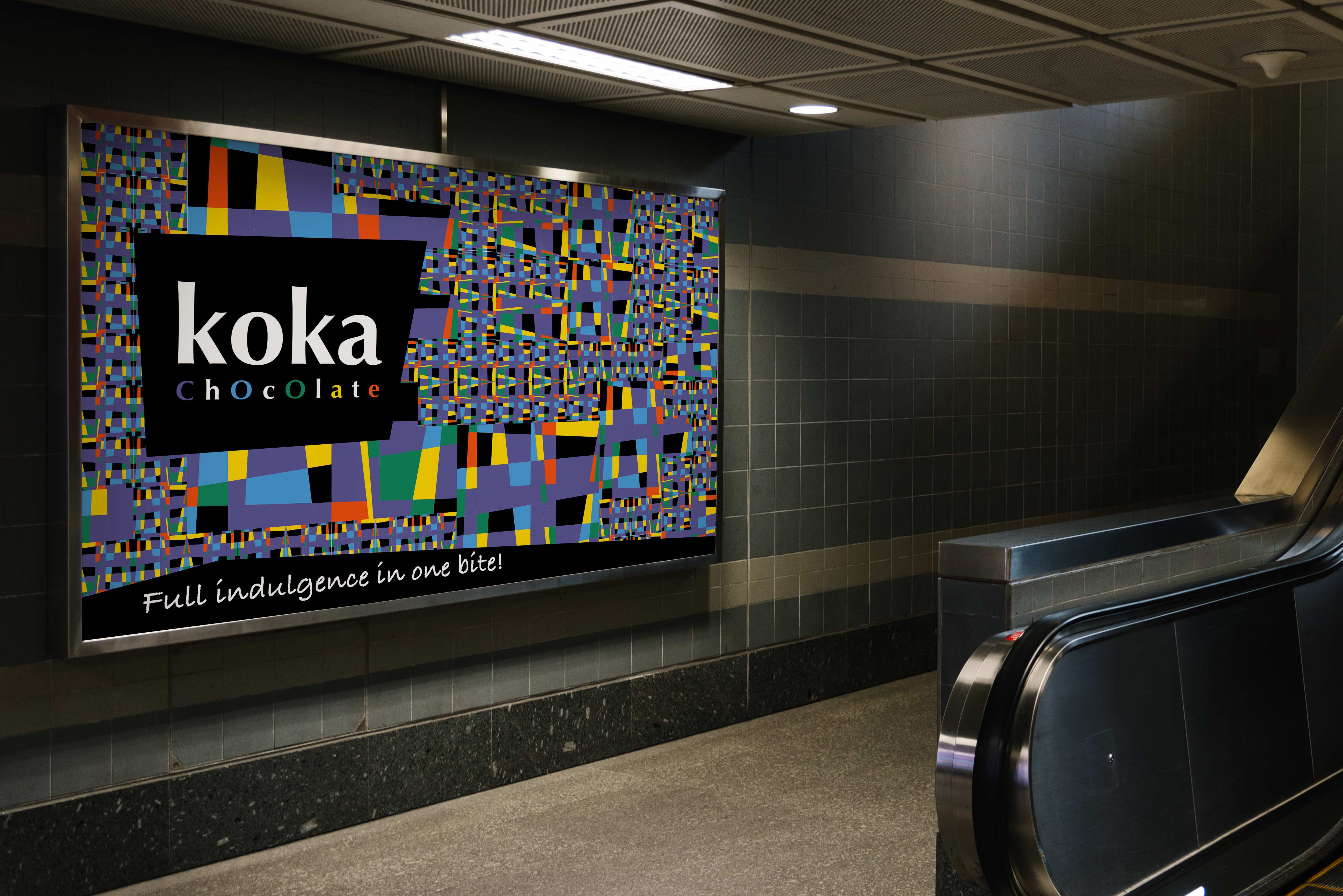
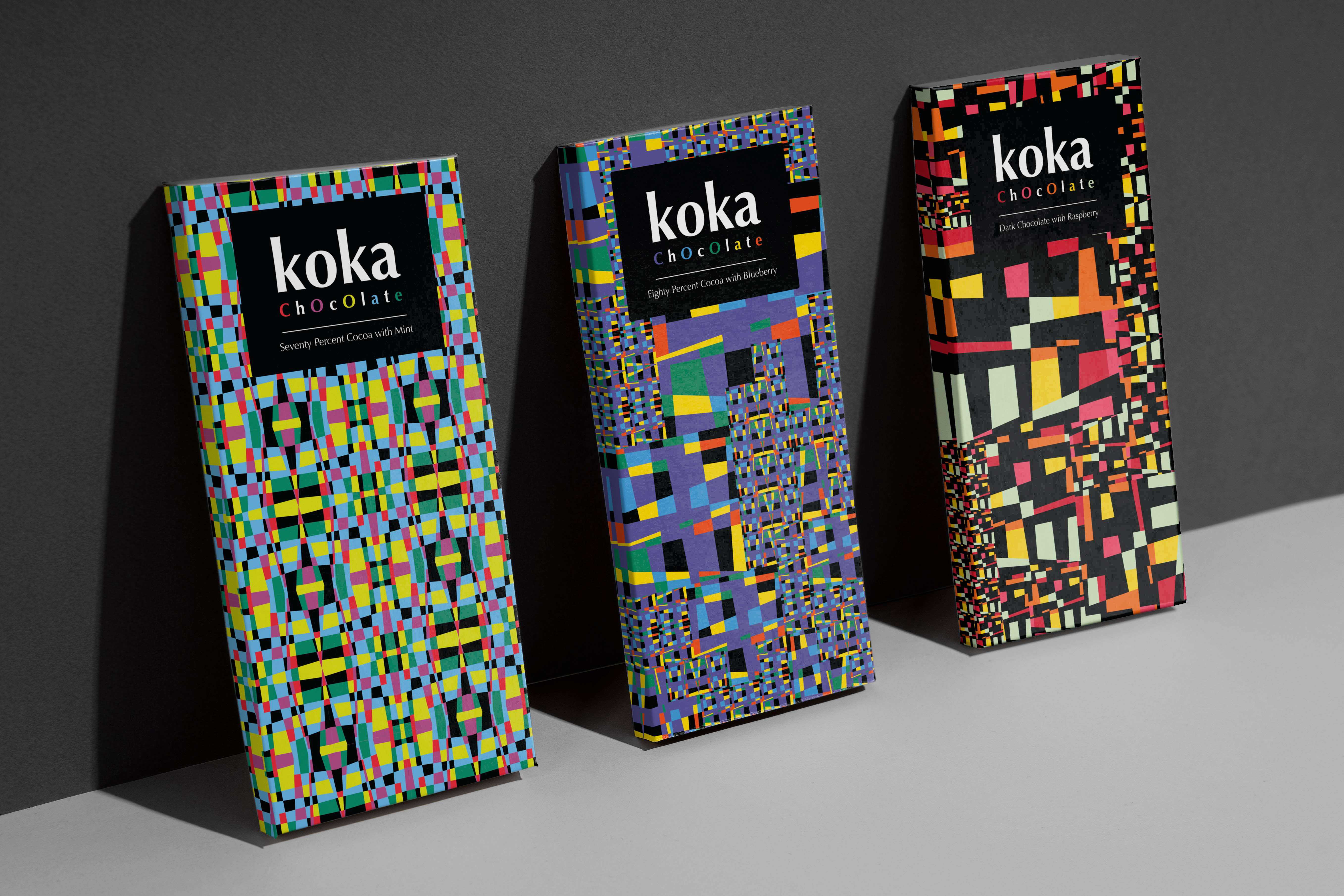
Koka
Packaging, Brand Identity
Crispy, colorful, and young.
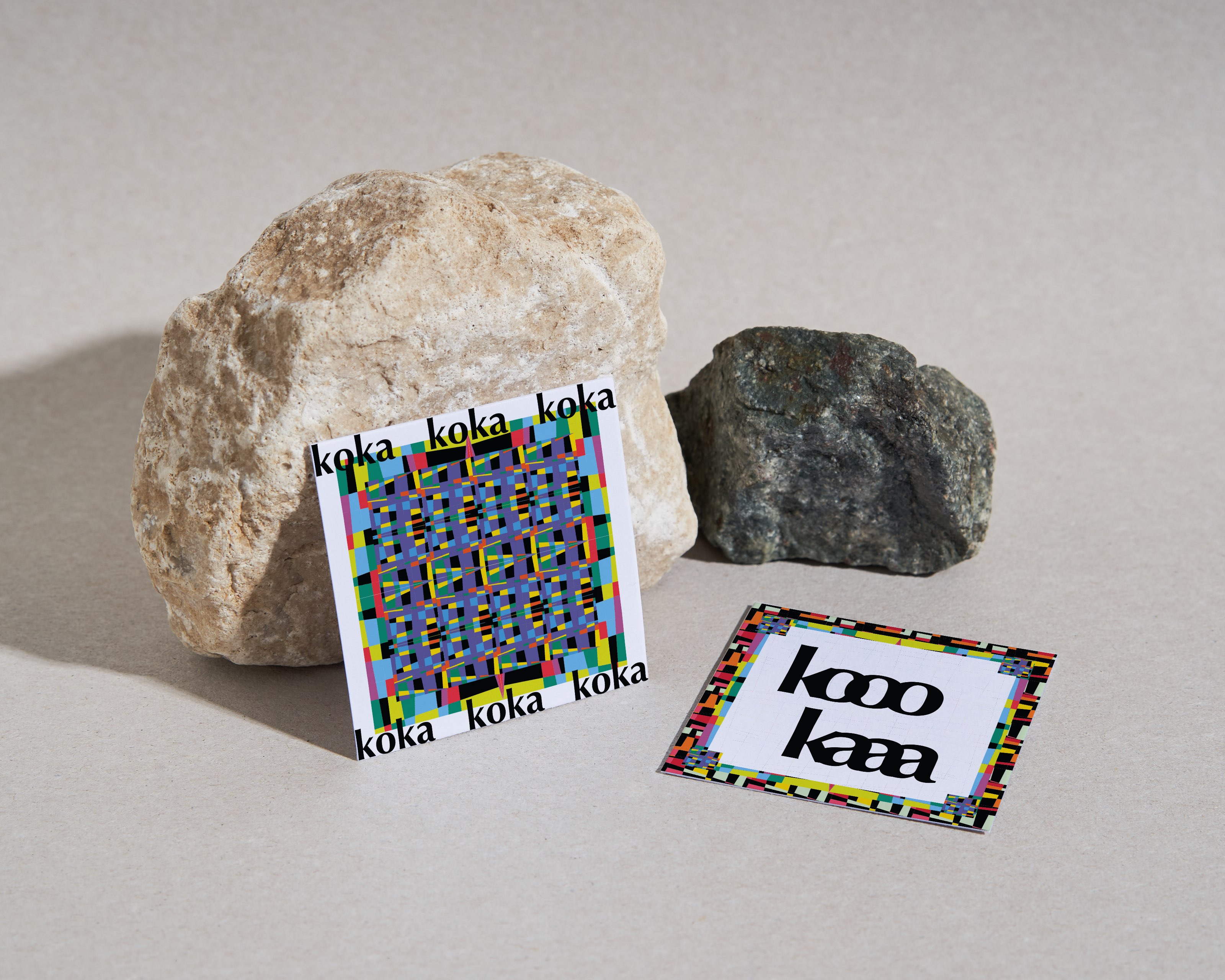
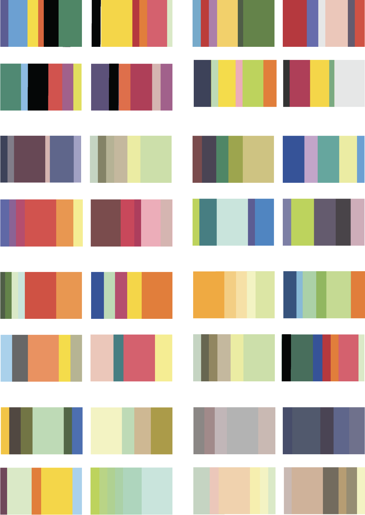 Color Experimentation
This project is a design practice from a color class. I was asked to experiment with pure colors and generate color patterns that evoke emotions.
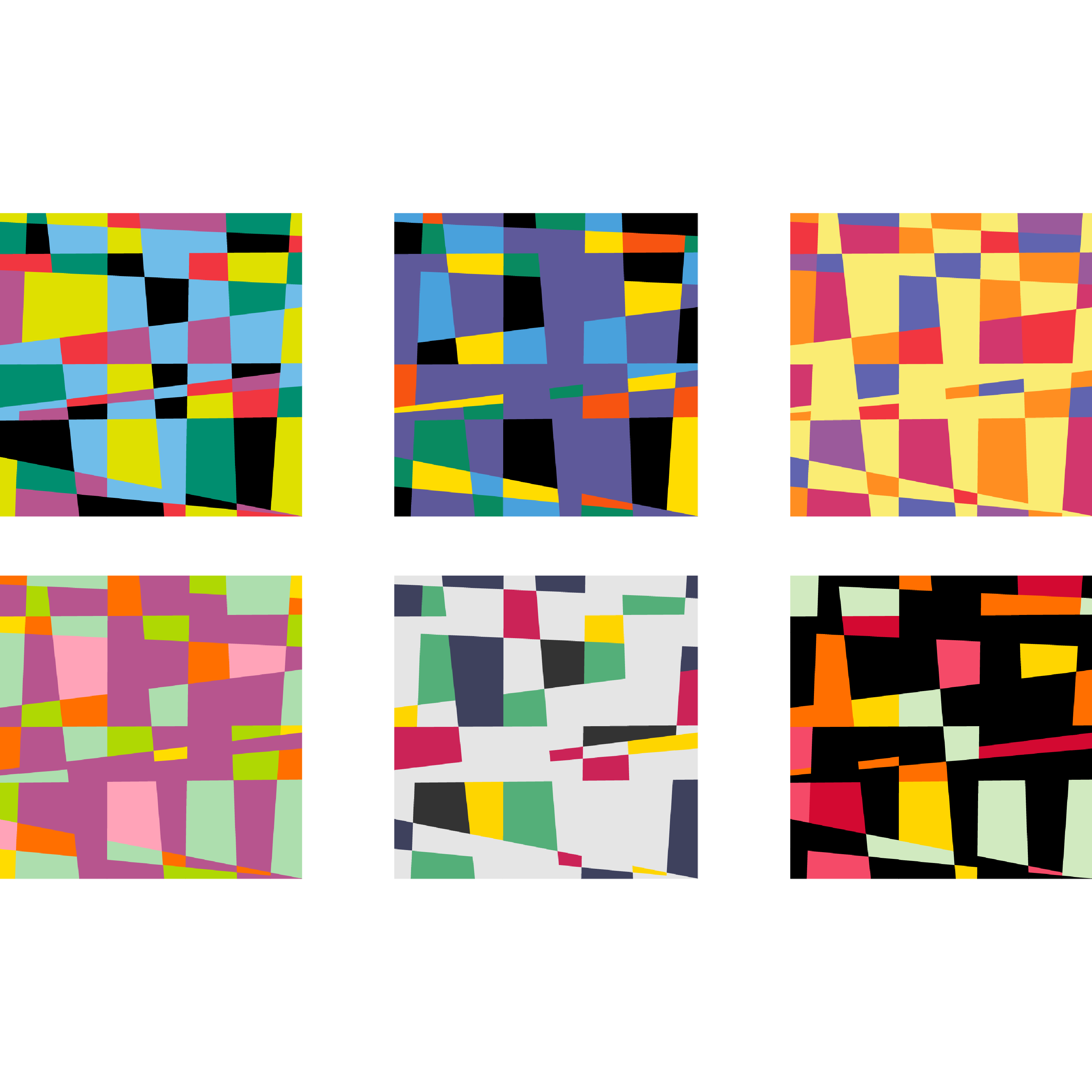
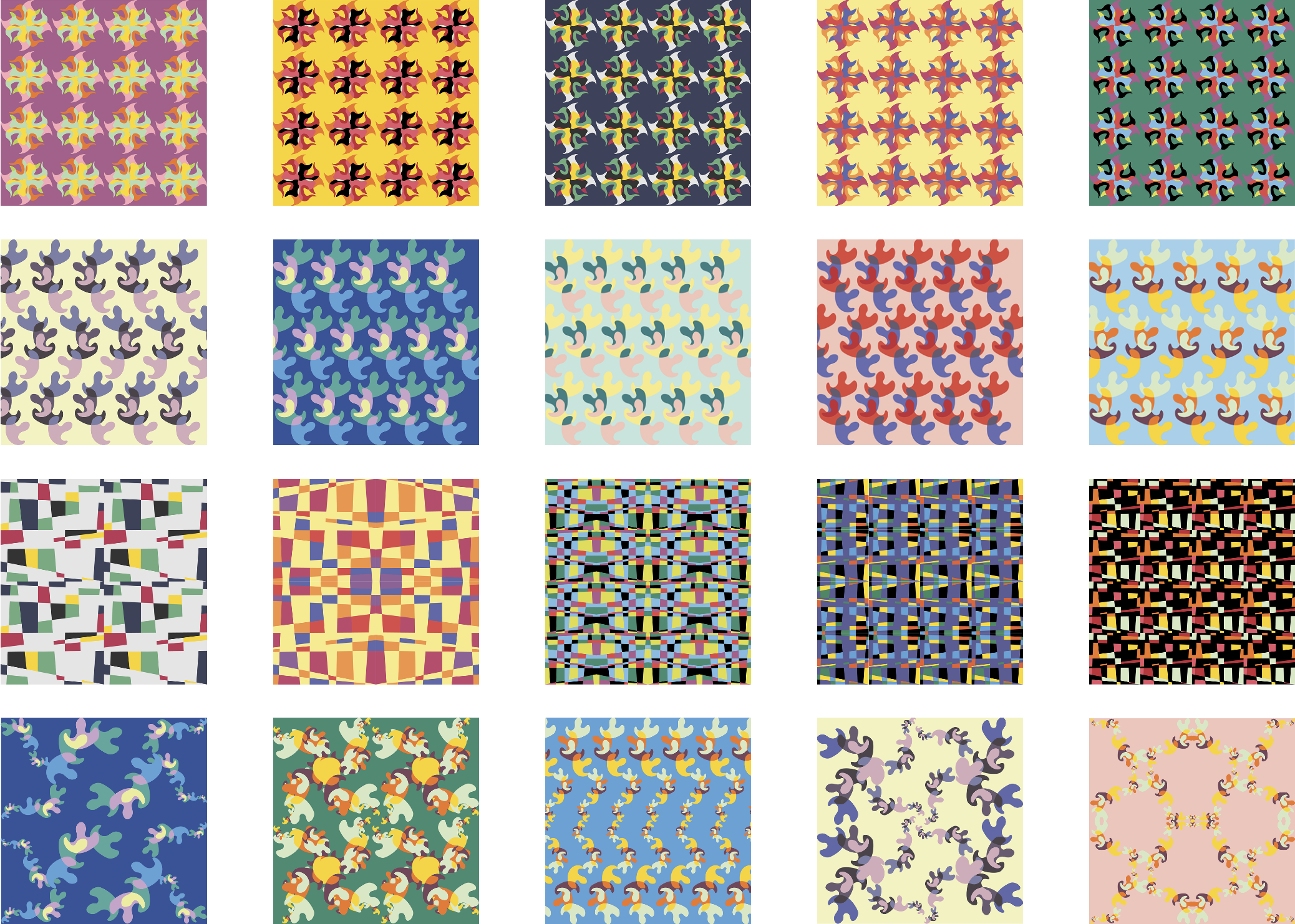 Pattern Generation
In the project’s last phase, I had the freedom to turn the color patterns into something I was passionate about — branding. I chose one set of patterns and found them a nice fit for a chocolate brand and came up with the name Koka, which sounds crispy and young.
Different color schemes are for different chocolate flavors.
By changing the size and direction, the basic pattern units can generate larger patterns with different compositions.